Mar 9
赤焰号角 - cute168178
各位亲爱的朋友们:
为了让朋友们更好体验游戏,结交到更多的朋友,我们计划于2025年3月10日(周一)10:00-11:00 时部分服务器停机维护进行数据互通。进行数据互通的服务器受维护操作完成时间影响可能会有提前或者延迟开启的情况,请朋友们见谅,给朋友们带来不便敬请谅解!
合服时间:2025年3月10日(周一)10:00-11:00
合服范围:5-10、16-26、28-31
注:具体合服区域以游戏内合服数据为准,若有变化会另行通知
数据互通规则:
1、数据互通后,原来多组服务器将实现数据互通,玩家须通过原有的服务器登陆游戏;
2、数据互通后,服务器会重新统计所有排行榜,在下个统计时间之前,全部随机排序;
3、数据互通后,不会对原角色、装备、经验、元宝、等全部游戏数据产生任何影响;
4、数据互通后,清除王城争霸活动数据,合服后重新争夺;
5、数据互通后,已删除的所有角色邮件一起删除,其他的不处理;
6、数据互通后,帮派内所有角色均被删除以后,则解散并清除该帮派;
7、数据互通后,合服后合并市场里所有物品,如果人物已被清除,则该人物在市场里出售的物品一并清除。
8、角色清理操作:
1)角色等级小于250级;
2)角色实际充值金额为0(真实充值金额);
3)未登陆游戏天数大于7天。
合服活动:
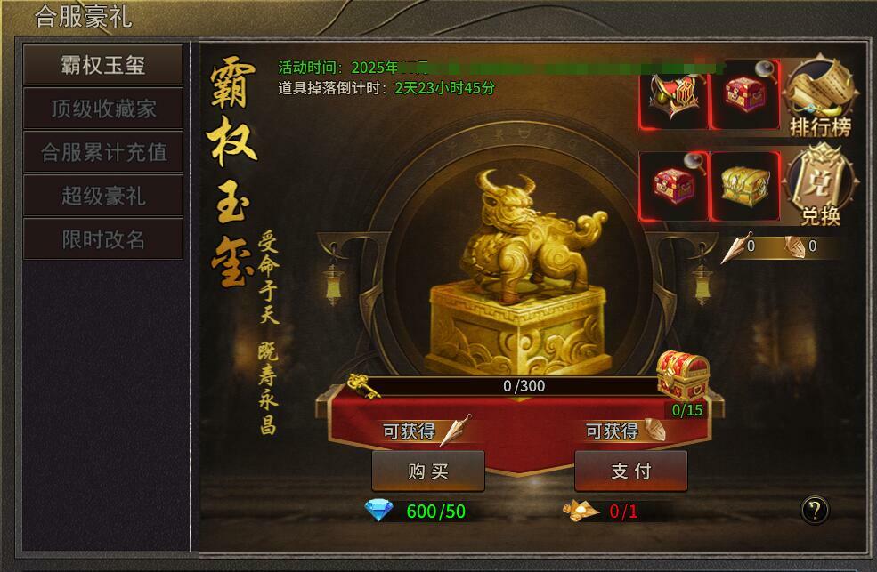
活动一:霸权玉玺
活动时间:合服1-3天
活动内容:活动期间,击杀200级以上BOSS有几率掉落活动道具。
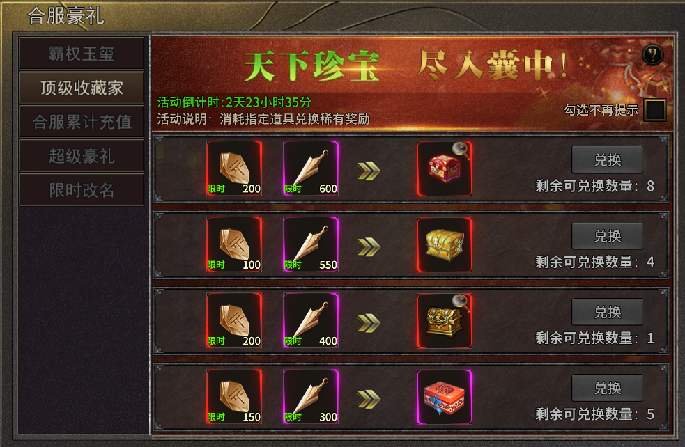
活动二:顶级收藏家
活动时间:合服1-3天
活动内容:活动期间,使用活动道具可兑换奖励。
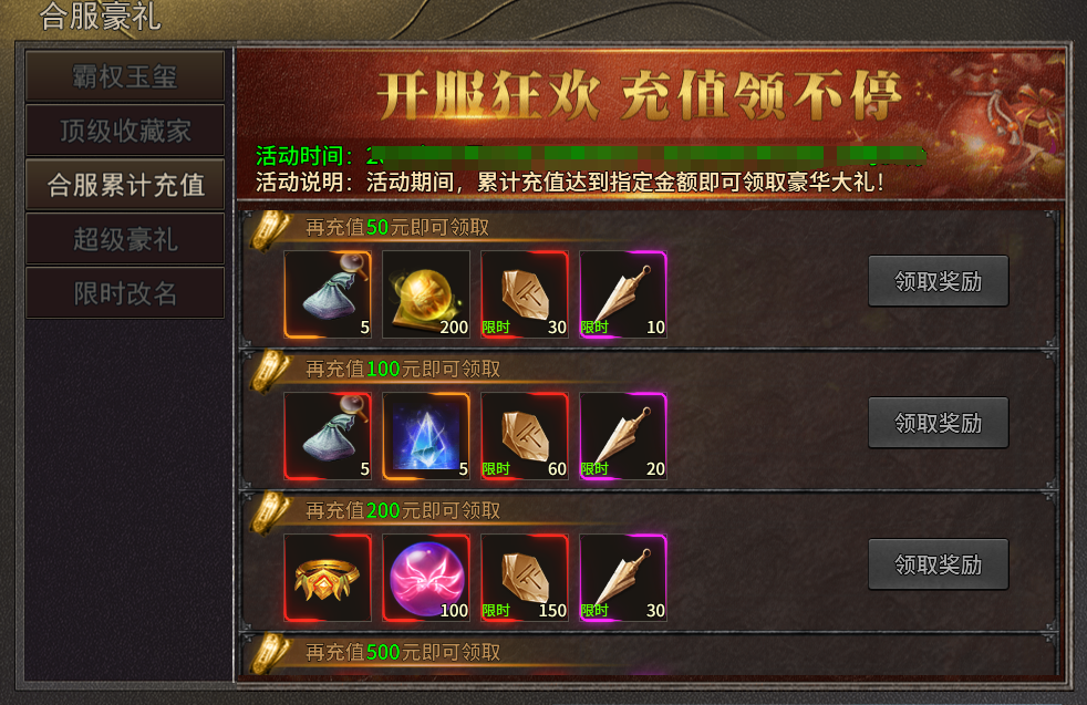
活动三:累计充值
活动时间:开服1-3天
活动内容:活动期间累计充值即可领取奖励。
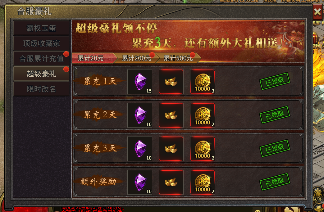
活动四:超级豪礼
活动时间:开服1-3天
活动内容:连续3日累计充值满足条件还可额外领取奖励!
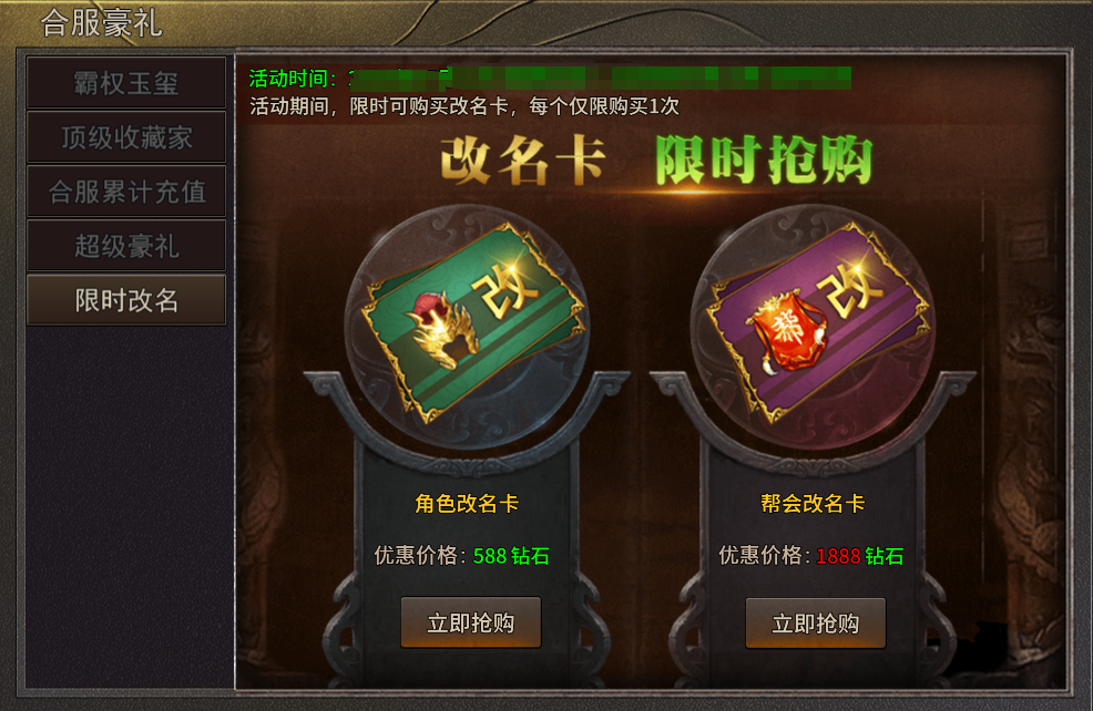
活动五:限时改名
活动时间:开服1-3天
活动内容:活动期间,可购买改名卡与帮会改名卡,每个仅限购买一次!
为了让朋友们更好体验游戏,结交到更多的朋友,我们计划于2025年3月10日(周一)10:00-11:00 时部分服务器停机维护进行数据互通。进行数据互通的服务器受维护操作完成时间影响可能会有提前或者延迟开启的情况,请朋友们见谅,给朋友们带来不便敬请谅解!
合服时间:2025年3月10日(周一)10:00-11:00
合服范围:5-10、16-26、28-31
注:具体合服区域以游戏内合服数据为准,若有变化会另行通知
数据互通规则:
1、数据互通后,原来多组服务器将实现数据互通,玩家须通过原有的服务器登陆游戏;
2、数据互通后,服务器会重新统计所有排行榜,在下个统计时间之前,全部随机排序;
3、数据互通后,不会对原角色、装备、经验、元宝、等全部游戏数据产生任何影响;
4、数据互通后,清除王城争霸活动数据,合服后重新争夺;
5、数据互通后,已删除的所有角色邮件一起删除,其他的不处理;
6、数据互通后,帮派内所有角色均被删除以后,则解散并清除该帮派;
7、数据互通后,合服后合并市场里所有物品,如果人物已被清除,则该人物在市场里出售的物品一并清除。
8、角色清理操作:
1)角色等级小于250级;
2)角色实际充值金额为0(真实充值金额);
3)未登陆游戏天数大于7天。
合服活动:
活动一:霸权玉玺
活动时间:合服1-3天
活动内容:活动期间,击杀200级以上BOSS有几率掉落活动道具。
活动二:顶级收藏家
活动时间:合服1-3天
活动内容:活动期间,使用活动道具可兑换奖励。
活动三:累计充值
活动时间:开服1-3天
活动内容:活动期间累计充值即可领取奖励。
活动四:超级豪礼
活动时间:开服1-3天
活动内容:连续3日累计充值满足条件还可额外领取奖励!
活动五:限时改名
活动时间:开服1-3天
活动内容:活动期间,可购买改名卡与帮会改名卡,每个仅限购买一次!
Share: