Fix: AI death related logic Fix: Fixed the crash bug of AI being killed by a bear Fix: Fix the BUG that AI sometimes does not build Update: Tree model optimization, farm crop model modification Update: The protagonist can complete the task by manufacturing items through the panel Update: Charcoal production time value adjustment
Welcome back for another development update for TAP. I'm happy to report that things are coming along nicely. First of all; where am I at with the game?
Game Progress
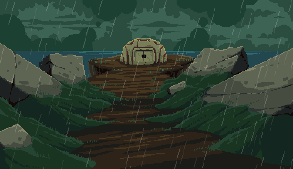
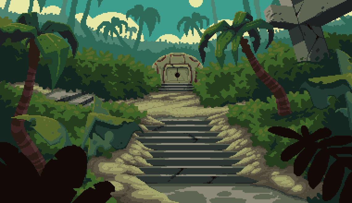
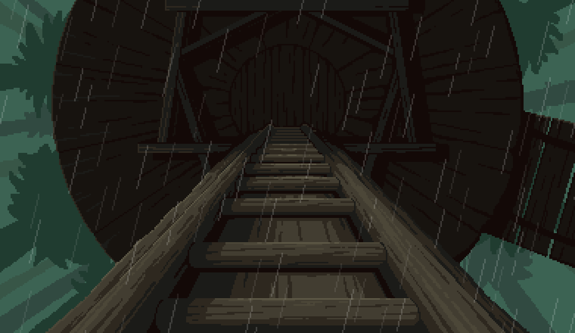
Well, I'm working hard completing more backgrounds, animations, and puzzles for Act 3. I'm almost done with the artwork for that Act.
My plan is to complete the background artwork/animations for all 5 Acts, then go back through the game and add some additional puzzles and artwork where needed. It's always easier said than done, but my game design philosophy is this; no artwork is sacred. What does that mean?
You may have noticed that many modern adventure games leave you sitting on one or two backgrounds (or maybe a handful) for 30-40 minutes of gameplay. Just going back and forth between those few areas, and jamming them with head-scratching puzzles. I personally don't like this. This ends up feeling like an escape room game, which have their place in the entertainment world, but ultimately leave narrative by the wayside.
Instead, I like a greater sense of physical movement and exploration. When you played the demo to TAP, you likely noticed that you quickly move from one area to another; a puzzle on one screen opens a path on a another. Some backgrounds don't even have a puzzle or an item to pick up, but they are essential for communicating the space and feel of the overall area. That's something I enjoy and that's what I am including in TAP.
I believe there are something like 270 backgrounds (not including cutscenes) in TAP; each one unique. It's a lot of work, but it all contributes to an exciting adventure game experience.
UI Changes
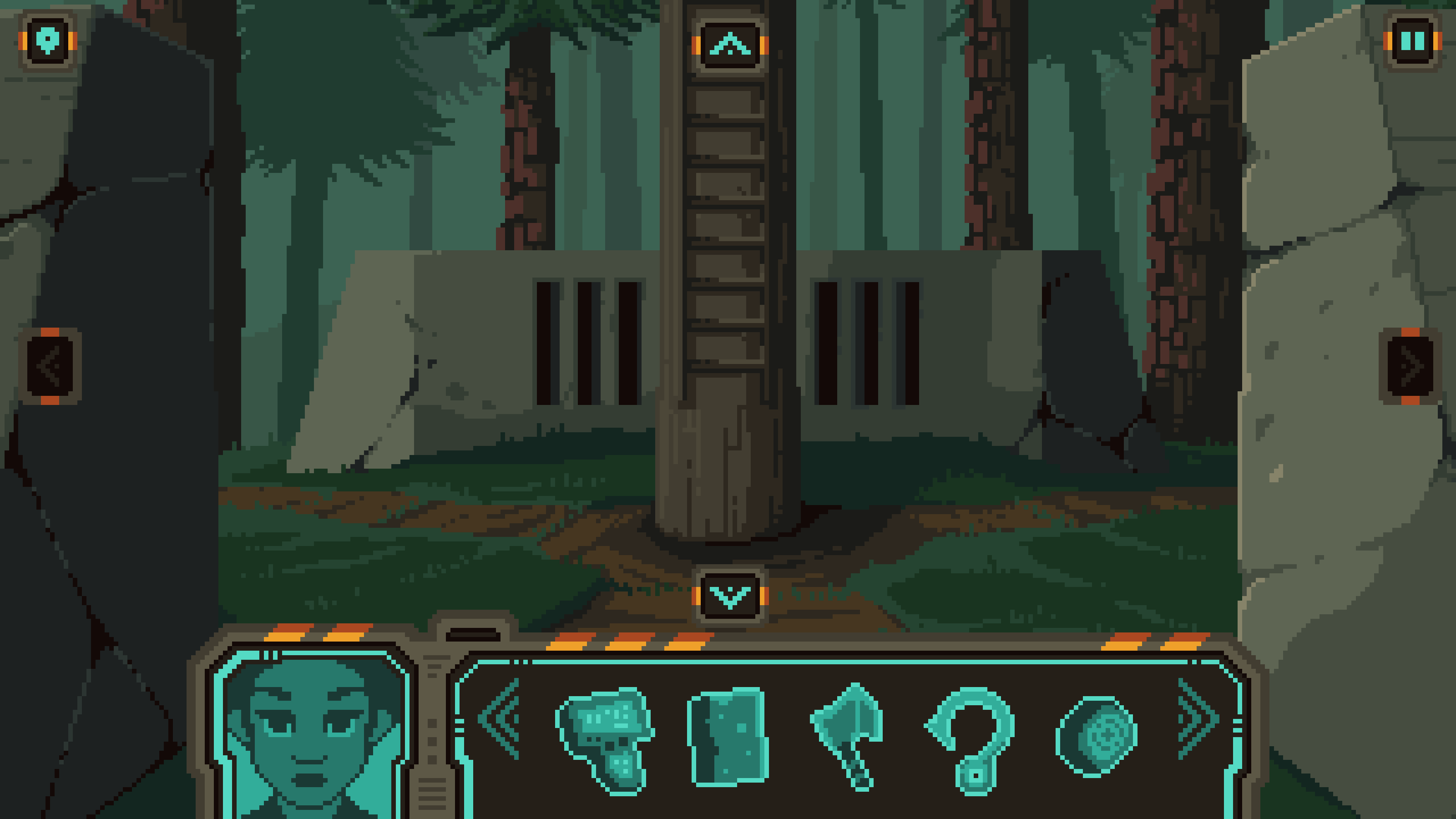
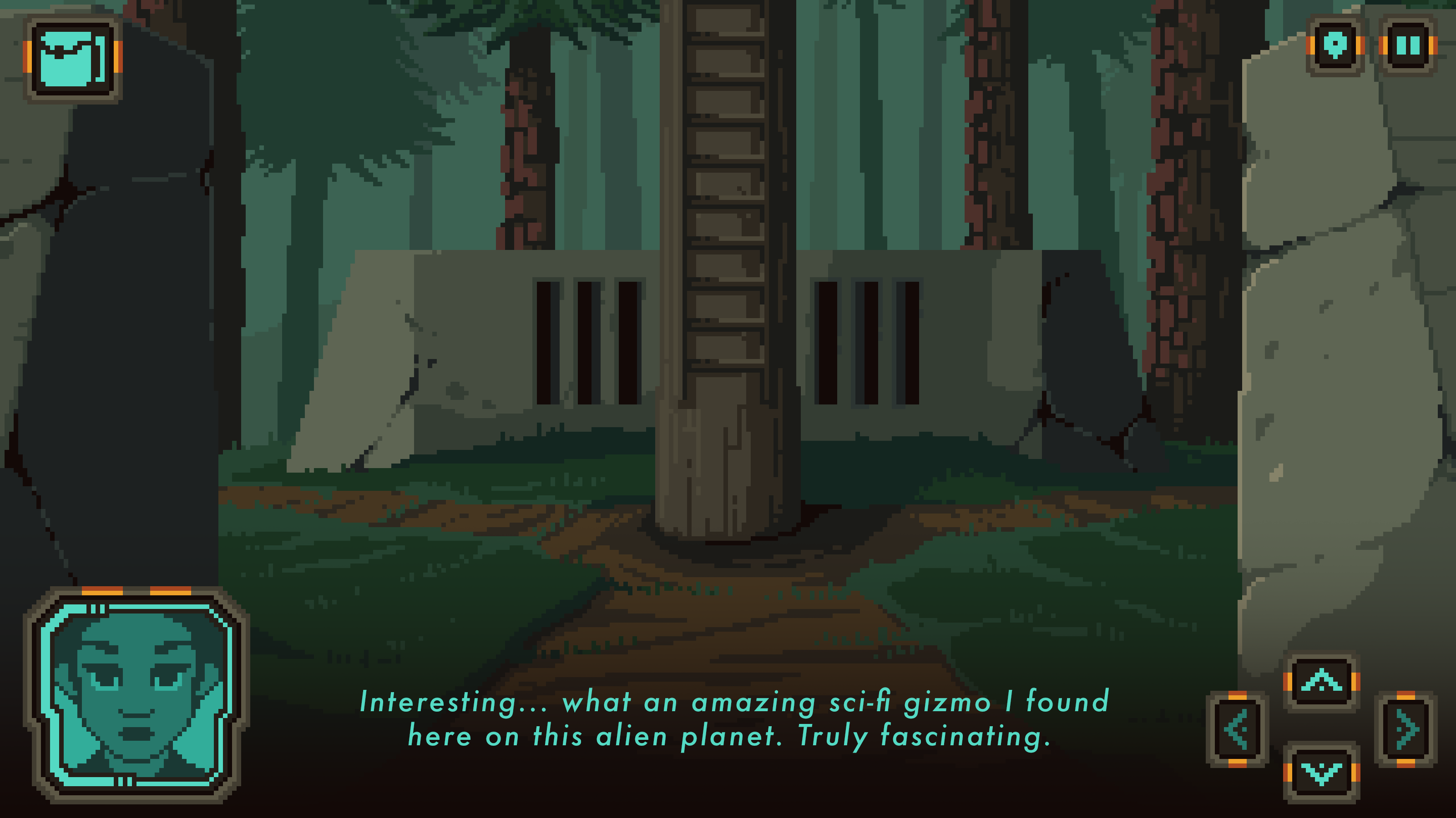
Now, on to the main topic -- I'm reworking the UI. I wouldn't call this a "major" change, because I'm not altering the aesthetic of the UI, but the position of the UI elements and possibly, the fidelity of the UI. For context, here is how the UI currently appears in the game:
While I do like this, and while it technically "works", there are a few issues:
The portrait/inventory take up a lot of permanent space on the bottom.
For those who wish to click the arrows on screen (as opposed to using the WASD or arrow keys, which is what I prefer to do), the arrow buttons are far apart on the screen. This means that the player has to constantly move their cursor across the entire screen to navigate.
The pixel art font is no good for localization
The pixel art font is terrible for accessibility
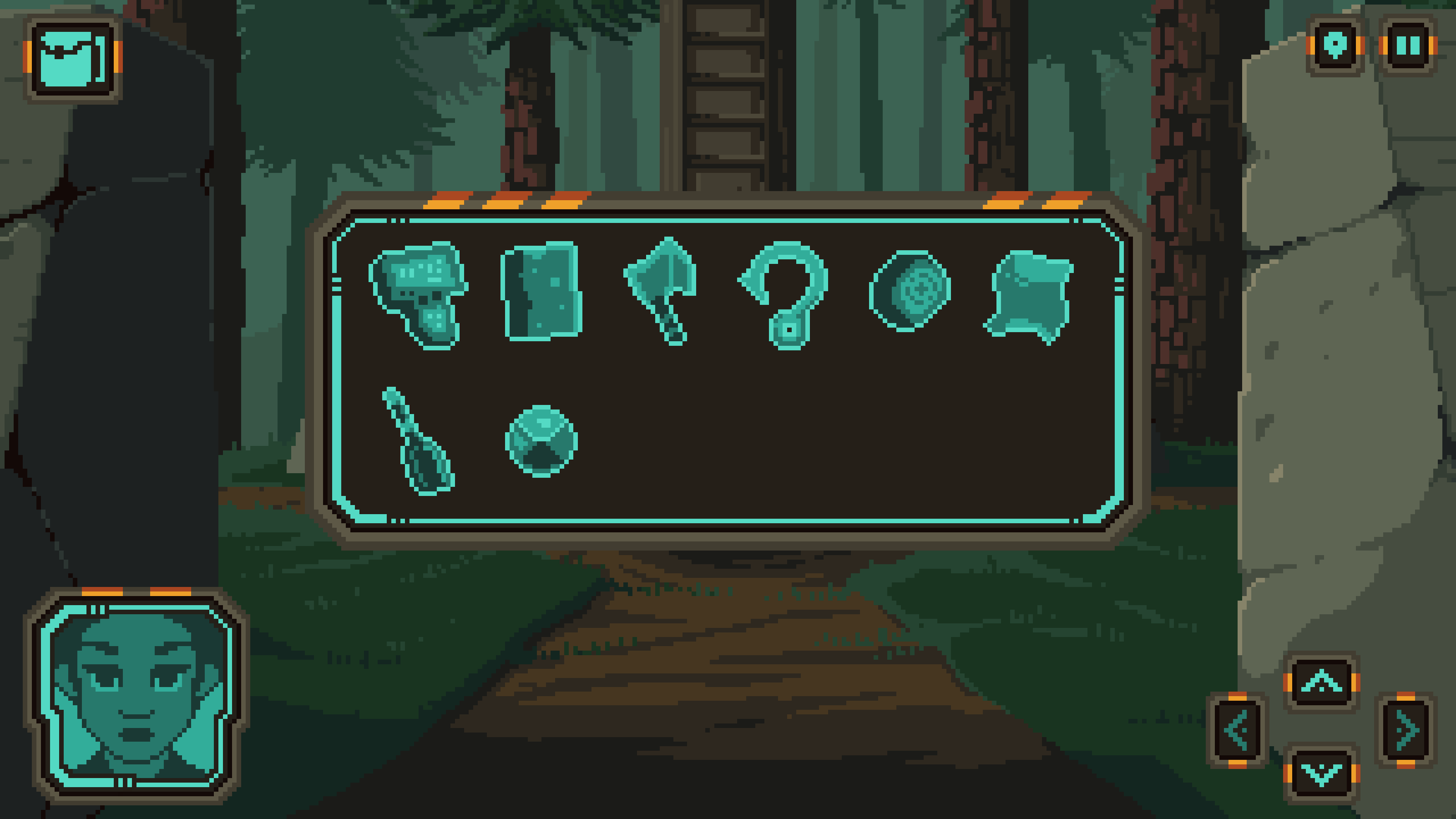
That said, I have come up with the following solution:
This fixes the issues described above:
The portrait is now on the left side and the inventory opens on a button click, thus freeing up that space on the bottom.
The arrow buttons are all located on the right side, making it easier to click on them (if that's your preferred method of interaction).
The use of an HD font is perfect for localization.
The HD font is perfect for accessibility.
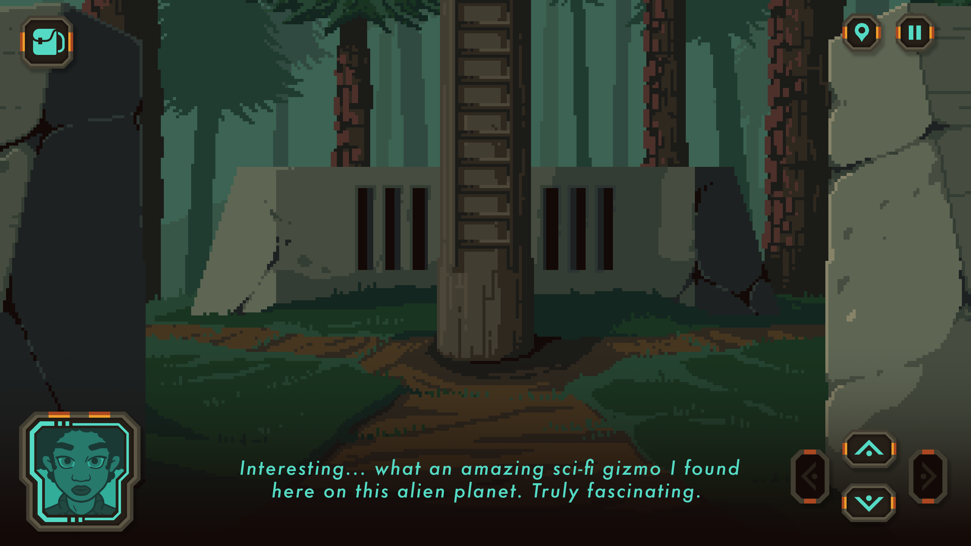
Now, using a HD (regular) font got me thinking that maybe making the entire UI HD would look good. I took a day and come up with this:
So, what do you think? Personally, in my opinion, I like the pixel art UI with the HD font. Not only do I like the way it looks, but the font is so much easier to read. I feel that the HD UI really clashes with the overall retro/pixel-art aesthetic of the game.
But what's your opinion? I'm making this game for YOU to play it. Which UI would you prefer to interact with?
I look forward to hearing your feedback. Thanks again for following the development, and don't forget to tell you friends about The Abandoned Planet!
Today is a new patch day and we have serveral things ro report!
Badges The badges for achievements have been extended to five, showing now: Championship-, 2vs2-Tournament-, Fun Tournament-, 2vs2- and 1vs1-Leaderboard-wins. All obtained badges will be displayed in the leaderboards but also in the lobbies.
Display of being in a Team You are already in a team but still get invitations from friends? Not anymore, being in a team will now be displayed in the friend list.
Ranking points The ranking points have been adjusted to tune the grind factor down. We continously monitor them and further changes may follow. See the linked picture for details. https://ibb.co/Lx4rBwY
Leaderboard rewards Leaderboard rewards have been adjusted and are now displayed when hovering over the tier in the leaderboard section.
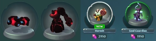
New Skins Four new skins have been added to the game, welcome the Hermit, Soul Guardian and the two exclusive Championship Tournament Skins designed with the Champions. While the first two will be available for purchase immediately, Fe2lx and Paperpancake can enjoy the latter for a week or two before they are free to buy for all.
New Icon A new icon of her Highness, the King Sapling, has been added, priced to be difficult to obtain. You now have a goal to reach for but also can show off with that hoard of gold that you've collected.
Balancing Balance changes have been implemented, background information will be posted in an extra news! Changes without comments: https://crystal-clash.com/patch-notes
Feel free to check out our newest game in development, Galactic Glitch, an Action-Roguelike that we want to make just as fun and enjoyable as Crystal Clash.
Just like with CC, we would love to hear your feedback on the game, so we can keep making it better! 🎮
The demo is available right now, for free! You can check it out and Wishlist here on Steam:
Currently, a bug has been identified in v3.9.8 where saved data does not load properly in some environments. We are currently investigating the cause of the problem, but it is expected to take some time to identify the cause, so we will perform maintenance again.
Maintenance period
Undecided We recommend that you do not play the game during this period, even in offline mode. Once the saved data is secured, another update will be made and the maintenance will be completed. To prevent recurrence due to recurring problems, it is with great regret that I must inform you that, this maintenance may take several days – several weeks to achieve detailed reproduction testing and automatic case-by-case restoration.
About save data recovery support
We plan to implement an individualized save data recovery support for all those contacted individually. All online play users will have periodic backups and will be able to restore from regular backups even in situations where platform saves or game server saves cannot be obtained. (Please note that a rollback of up to 24 hours may occur.) Since the resolution of the problem in v3.9.9 is the first priority, all individual restoration responses will be made after the maintenance is completed.
About the Seasonal events (Sin)
With the implementation of the maintenance, the duration of the seasonal events will be extended according to the time required for the maintenance.
We are truly sorry for any inconvenience caused by the repeated problems. We apologize for the delay, but please wait for a while until we prepare to reopen the game safely.
- NEW SONG: "Clout da Exp!!!" - Added speed slider in level editor - Added FC Indicator - Added Shake Event toggle - Added color grading effect (Later cubes are more faded) - Added Volume percentage and Audio Offset millisecond text - Updated Modifiers Menu
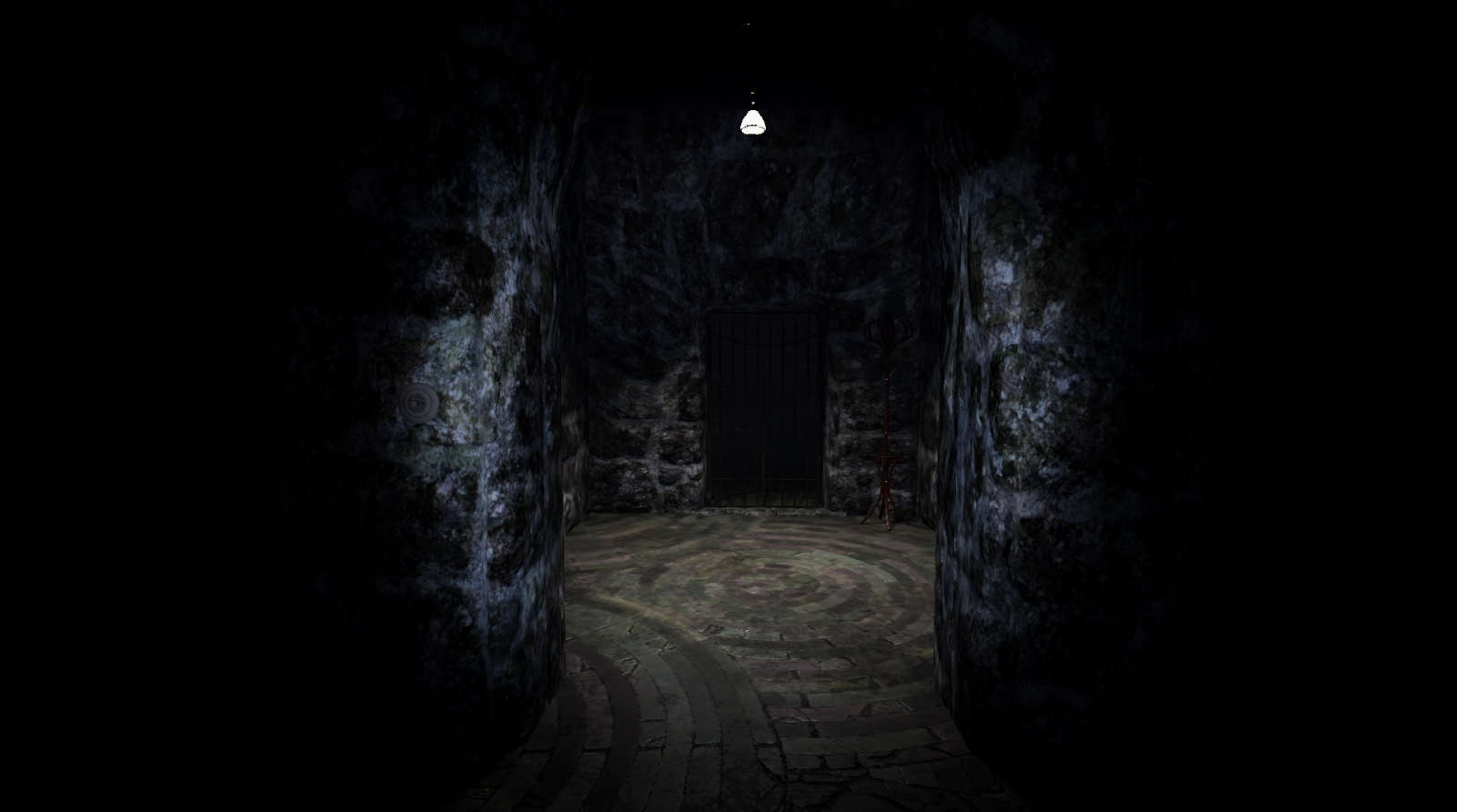
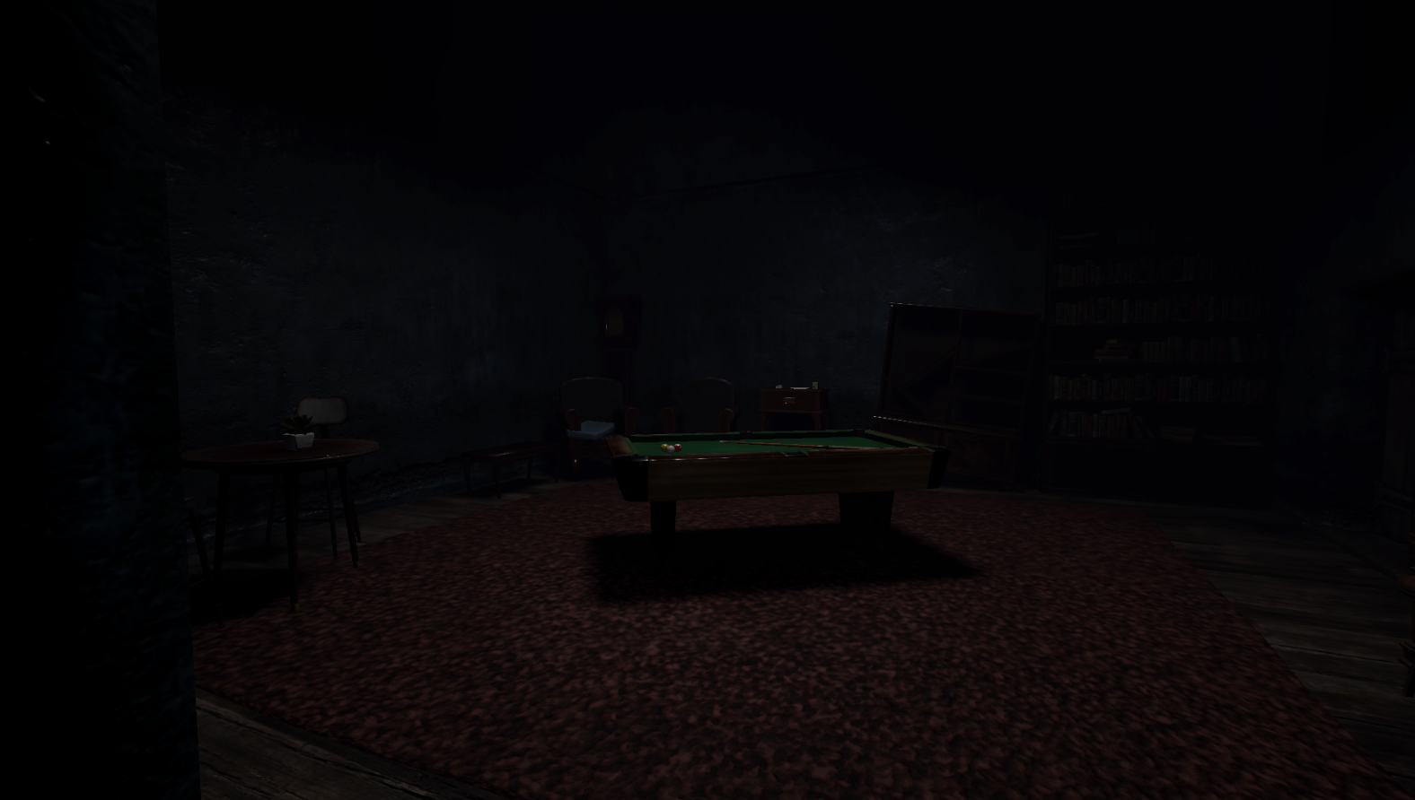
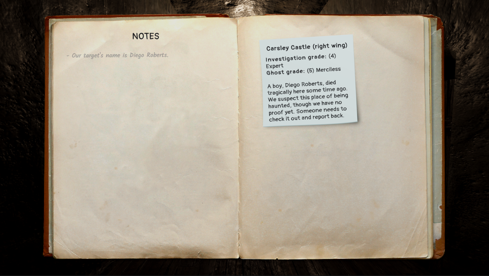
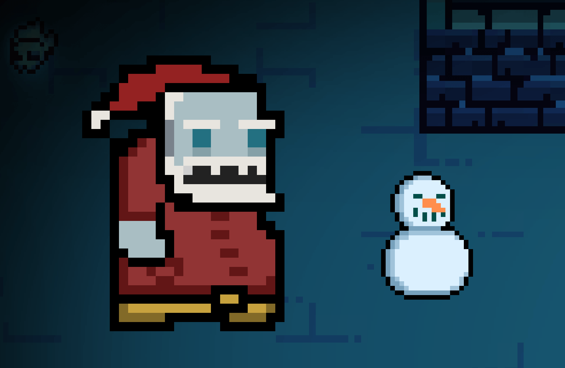
New Features & Changes - Added THREE new maps: Carsley Castle (full), Carsley Castle (left wing) and Carsley Castle (right wing). - Added dozens of new story elements and items. - Pressing TAB ingame now brings up the notebook. Players can take notes during the investigation, and if they die other players can find the notes they left by interacting with their body. - On ghost difficulties 3 or higher, exorcisms cannot be completed successfully by simply waiting anymore. - More objects now emit various noises in the maps. - Removed Halloween decor.
Adjustments - Rebalanced all probabilities for story elements to make stories more varied. - Made all flashlights slightly better. - Added a new section in the tutorial that explains how to use the notebook. - Added a line in the tutorial that indicates that objects can be reset to their initial position using the escape menu. - Reduced the chances of encountering the same ghost multiple times in a row. - When facing a Reflection, objects in the mirror dimension now appear in both dimensions, with a visual effect to differentiate them. - Replaced all alcohol bottles models.
Bug Fixes - Fixed a bug that caused the "reset objects" button not to work on some objects. - Fixed a bug that caused too many stories to be about children instead of adults. - Fixed a bug that caused a non-host electrician's flash not to blind monsters. - Fixed a bug that caused the electrician's light to be the same as the others - Fixed a bug that caused non-host players to be unable to spot the red room as the medium. - Fixed a bug causing the medium's vision to work incorrectly in the mirror dimension. - Fixed a bug allowing the medium to see ghosts through wall. - Fixed a bug where objects thrown to an orphan would go on the exorcism table at the same time. - Fixed some typos in English.
Special thanks to Léon, Grisette, Iggy, Chatoune, Isaac, Orion, Popiette and Touffu for lending their pictures for one of the new items :) Enjoy!
Recently we've been posting a series of comparison clips between many of the older designs from early development and how they look now. Unfortunately we've found neither our blog nor here has a good format for compiling them in one place, so instead we made a dedicated page on our website for them. You can go here to see the full page of graphical comparison clips.
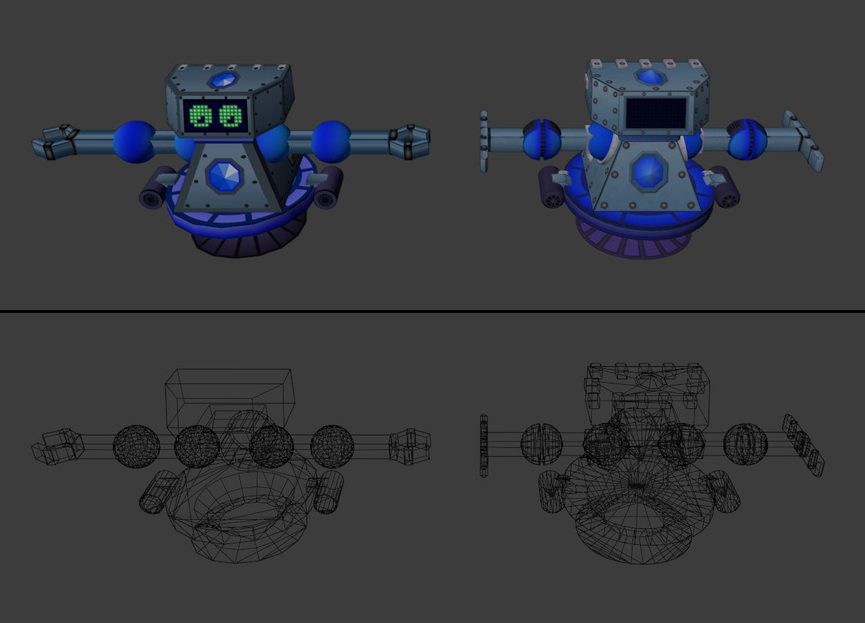
Here's a few highlights anyway though, despite this not being the best format to show them in. First we have the original Turret and Player models getting their graphical upgrades.
And also a bright/dark comparison to really show off how nice the new emission textures are being put to use. Yes there is a setting in-game to turn off the lights and play in the dark.
And of course the main arena's graphical upgrade. I'm really proud of how this came out, it might not seem like that much compared to some of the other graphics, but if you were to go back and play the original demo and then come back to the current version it'd be incredibly clear just how much better the atmosphere is now. Also of course the UI is way better too.
One other comparison that's interesting to make is the upgrade to the player model. This is such a nice showcase of skill improvement because while it looks so much more detailed with more properly modeled geometry and details like the gems actually poking out instead of being textures... it's actually slightly lower polygon count! The original wasted an insane amount of polygons on the arm spheres, so optimizing the topology of those in the new model lowered it from 2,662 polygons to 2,592. Never underestimate how wasteful poorly optimized spheres can be. Also bonus fact: the new model's face can change expression, which is neat. For now this is all the comparisons we've made to the older assets, if in the future we post more screenshots or videos, the dedicated page will be updated to include them.
That's all for now, if you would like to keep up to date with news and announcements consider checking out our various Social Media accounts or the News page of our website.