Warhammer The Horus Heresy: Legions - EGPepe
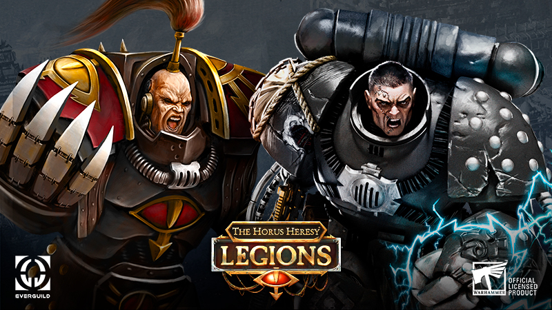
"I'm leading this speartip!"
– Abaddon

New event! Hoping to exploit a flaw in the Saturnine Gate, Abaddon plans a strike beneath the structure using assault drills. Suspecting foul play, Rogal Dorn organizes a series of kill-teams to confront the traitors.

Pick a side in this underground assault and decide which card will become collectable! Don't miss your chance to try a new event-exclusive Warlord!
Heroes & Generals - Reto.Hades


Soldiers!
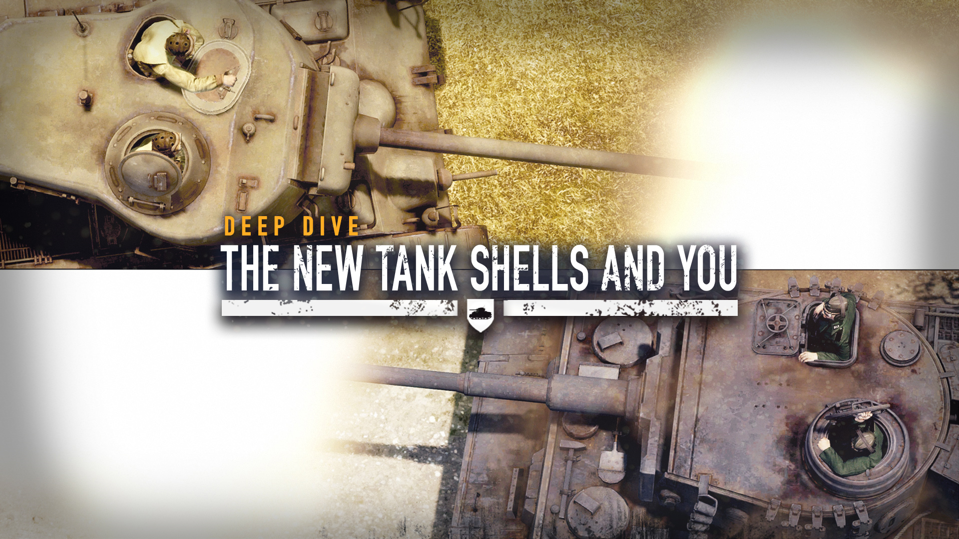
A lot of changes have been made to our armor system in 2021. Earlier this year we introduced the first set of changes, where we increased the power of AP shells, made armor more sturdy and reworked HE shells. All done to make sure the biggest tank doesn't always have the strongest explosive power. Last month we completed the reworked tank combat by adding tons of new ammo types.

In this blog post we are going to take a deep dive into the new shells while highlighting our earlier changes. Which shells should be used against which opponent, what are the strengths and weaknesses? Find out by reading the information below!

Community links!
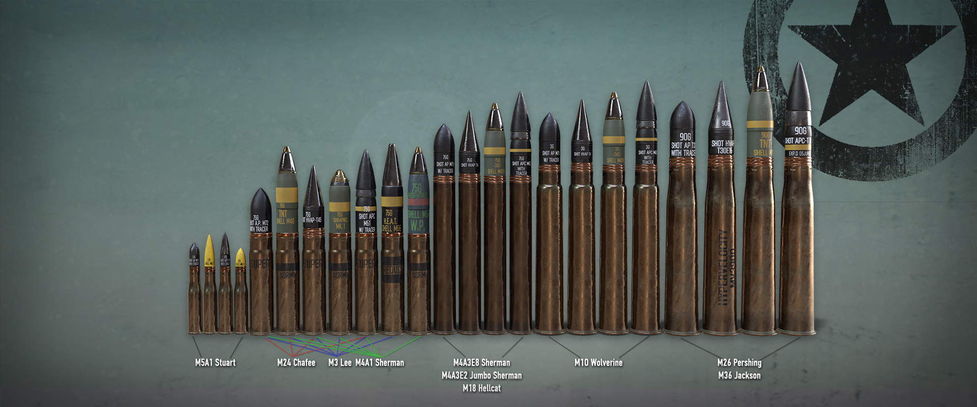
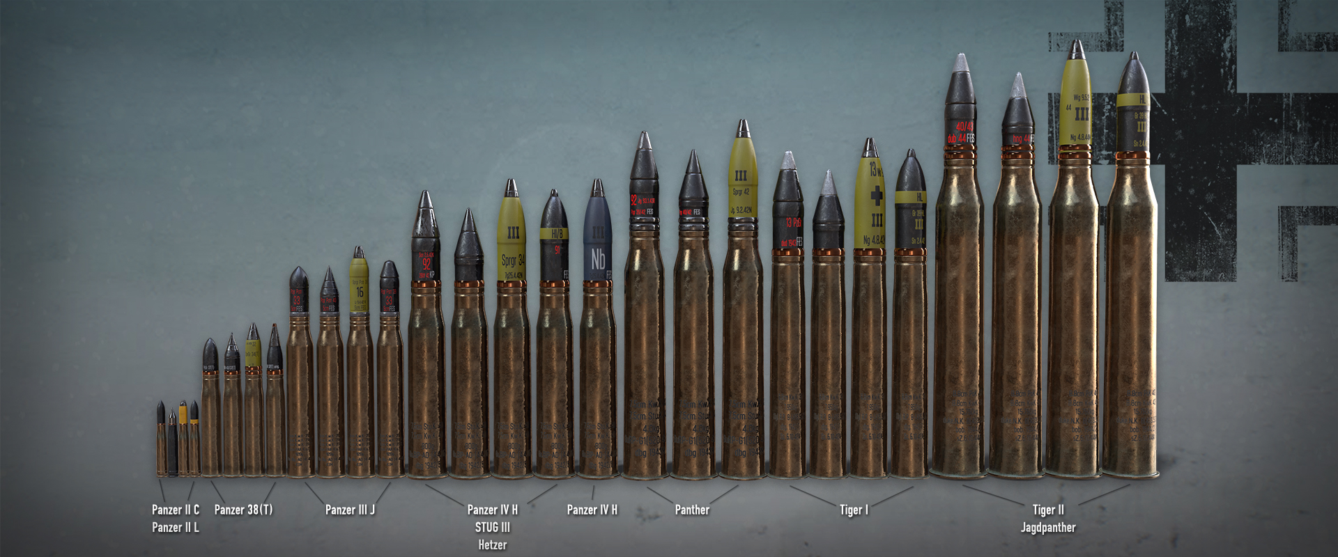
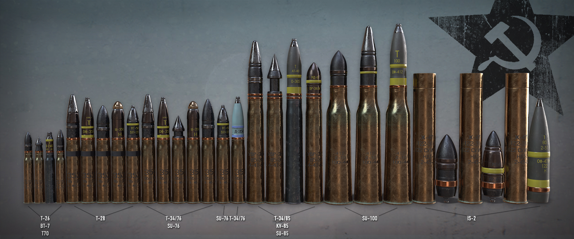
Not all tanks will have access to every type of shell, you can take a look at the images below or look ingame at the 'Specialist Ribbons' for each tank.
You can also take a look out our community-driven Gamepedia here:
Gamepedia - Vehicle details

Another useful link is the community created calculator below. This tool contains details on both vehicles and infantry weapons.
Heroes & Generals Calculator vehicles

Please note that both websites are community created, and we cannot guarantee all the information is 100% accurate or up-to-date.
Video tutorial!
Are you more interested in a video tutorial?
Be sure to check out the tutorial made by Thakard


The eight types of shells
The game now has 10 types of shells, this includes 6 types that are specialized to take on enemy armor, 2 that are specialized to take on enemy infantry, 1 that can do both and finally a shell that creates a smokescreen. Below we will briefly talk about each of these shells and what they can do.


AP-shells
Each tank you buy comes with the standard AP shells. Also known as Armor-Piercing shells. They are the standard shells for each tank, one should certainly not underestimate their capabilities. The AP-round lacks penetration power, but can do a lot of damage. It is especially effective against lower-class tanks.

APCR-shells
The second available shell is the APCR shell. The Armor-piercing, composite rigid, which is also often called the HVAP; High Velocity Armor Piercing shell is a shell available to almost all tanks ingame. This shell specializes in penetrating the enemy vehicle, however this comes at a cost of damage. The APCR shell is the shell with the lowest damage-output. The performance drop over range is quite significant for APCR shells and are therefore most effective on shorter ranges. This shell is best used against strongly armored vehicles, or simply higher-class vehicles.

APHE/API/APC-shells
Next up we have a combination of three shells. The APC (or APCBC), or the Armor-piercing capped ballistic capped shell, the API Armor-piercing incendiary and the APHE Armor-Piercing High-Explosive. These shells are a direct improvement on the AP shell. They have better penetration values and do more damage, however they still cannot penetrate as much armor as the APCR shell can. These shells are excellent in a fight against lightly armored vehicles and tanks.


HEAT-shells
HEAT-shells also known as High-Explosive Anti-Tank shells, do not excel on either damage or penetration values on first glance, but the HEAT shells doesn't lose any penetration or damage over longer ranges. If you can penetrate it at 10 meters, you can also penetrate it at 1000 meters. This is a strength a lot of the other shells doesn't have. The fact it won't lose any damage due to range, this shell is excellent for longer range combat! The shells also produce a small blast on impact, doing significant damage to infantry.

HE-shells
High Explosive shells are available for each and every tank. As the name suggests, these shells are the best way to get rid of infantry quickly. They don't do much damage against tanks, but can be used against lighter vehicles. In most cases, HE shells are better on lower tier tanks than on higher tier tanks, this is especially visible in the medium tank category. For example, the American 75mm cannon (found on the M3 Lee, M4 Sherman and the Chaffee) has HE shells almost twice as powerful as the 76mm cannon used by the E8 Sherman!

SHR-shells
SHR, standing for Shrapnel is the second form of anti-infantry shell. It can only be used by a limited amount of tanks, but has some unique properties to set it apart from the other HE shells. The Shrapnel shell is unable to kill infantry with 1 shell (unless you hit the enemy directly), but the range of the explosion is double that of the HE shell! This allows it to damage enemies in a much larger radius.


DPHE-shells
The DPHE, Dual purpose HE shells is the least specialized shell in the game, it does not impress in penetration values, damage is low and it also doesn't excel against infantry... Then why would you use it? Well, because it can do all three. The DPHE is especially powerful against light vehicles and for example Armored Personal carriers. It also allows you to take on smaller tanks and infantry, without having to change ammunition in between.

WP-shells
Last but not least we have the WP-shells, White Phosphorous, which just like the DPHE shells can only be found on a very limited amount of tanks. These shells don't do any damage to tanks, but briefly explodes into an area of smoke around the target and do a limited amount of damage to infantry. The smoke only lasts a short duration, but is enough to make an enemy tank or soldier blind to your location. When facing an enemy tank that is superior to yours, firing some smoke shells on the enemy tank will make it much more difficult for him to put his sights on you which allows you to escape from the hostile beast. Not only that, but with teamwork, you can cover the enemy tank in smoke and allow your infantry to push or create space for a friendly tank who can bring it down!

See you on the battlefield!
RETO MOTO
Sep 17, 2021
Ghost Marriage Matchmaking - Threedays
As below step or link document.

1. Close your game.
2. Open windows explorer and put "%userprofile%\AppData\LocalLow\EternalAliceStudio" on path.
3. Search and find the game folder(Ghost Marriage).
4. Find "Player.log" & "Player-prev.log" files(txt format) and e-mail to EternalAliceStudio@gmail.com
#. Simply describe your bug in mail.

Guide document with pictures:
https://docs.google.com/document/d/13V4TeTUi5qmB0QjnxM8dg_0HLLX_-XUonFUefWOzVEY/edit?usp=sharing

Thanks for your report to make our game better.
Strategic Mind: The Pacific - KateMels
Hello, guys!

Last week we asked for your thoughts about the best fitting Store page screenshots types for the upcoming game Strategic Mind: Spirit of Liberty. We were pleasantly surprised by the amount of feedback we got. You have provided a detailed analysis of existing screenshots for previous Strategic Mind titles' and useful ideas for future screenshots. As developers, sometimes it is hard for us to see the game through the players' eyes, so your feedback is invaluable for us. Now we want to believe that we understand you a little bit better. So we appreciate all of your efforts, guys! We will try to heed your advice when working on the Strategic Mind: Spirit of Liberty screenshots revamp soon, as we now have more materials for them.

We want to share with you some quotes from the community on Steam and on Reddit about the Strategic Mind screenshots. Maybe it would be interesting for you to read and compare your ideas with the other players' perceptions, or even find your own commentary here:

1. Zoomed-out strategic view type of screenshot:

Likes: 5
Quotes:
-I like #1 - it shows a strategic view or something like that? I like to know what kind of tools a strategic game offers.
- The first one should be a little less zoomed out
- Looks like a different game.
- Don’t highlight interesting parts of the game.
- #1 is lovely. it shows you can have different combat arms of the army (air, navy, land/marine), and shows you can have more than just tiny snippet of forces.

2. HQ room type of screenshot:

Likes: 9
Quotes:
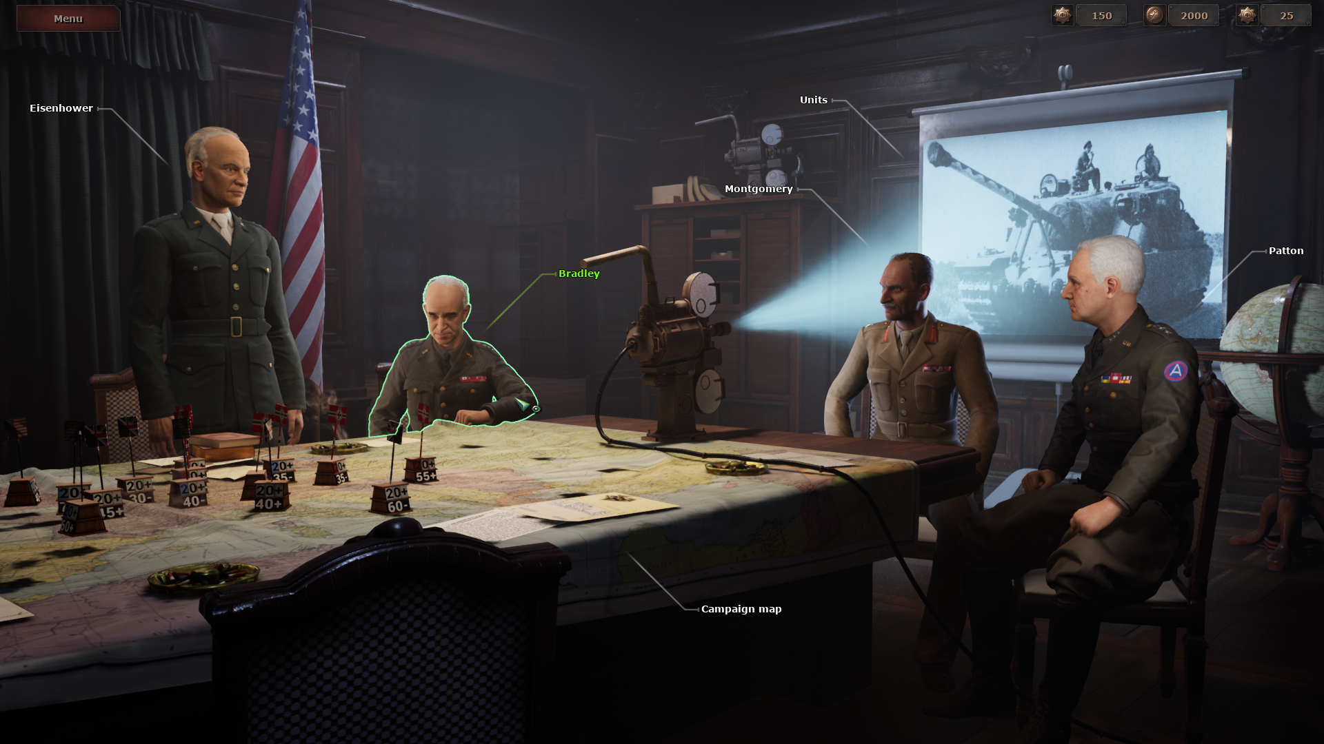
- #2 is something I would not appreciate on a strategy game page. That's a neat visual for a menu but that's not what I'm going to actually play, so it's kind of just noise.
- I'd avoid anything like 2. that sort of stuff could just be done with photo likeness written dialogue like other games have handled it.

I know it seems like some sort of special feature of these games but for me personally it is a put off a bit as I'm more interested in the challenge of the scenarios or the campaign than wading through some sort of' 'marionette' cut scene where a simple military style 'old school' dossier of the assignment or objective would be more immersive if done authentically maybe with a voice over like some game leaders in this field have done in the past because it's efficient for the player and adds enough immersion to get to the 'real' game
- Some people are looking for fast-casual playing similar to multiplayer game but many other people when play a single player campaign don't want just a chain of battles with a poor and forgetable introduction between them. They look for a full story and want to "make the difference" with their choices and actions. On the other hand, most games just show an "intro video" and a final "victory video". I love the work you made to create a screenplay and a background to connect every battle and the consecuences of the previous clashes like the image of Picture Number 2 and the mini-videos between battles. Screenshots should reflect that your game is more than a chain of battles with an "excuse-plot".
- Looks interesting, Using that would be good.
- I love this shot. Shows that there is more to the game than just standard RTS fare and clicking/moving units.
- Great, but maybe highlight the campaign map though instead of a general.
- I think this kind of image should always be included to the screenshots. Player spends a lot of time in this room, so it should at-least be represented (also it would remind the player that it's mostly story-driven).

3. Battlefield view with No UI and No hexes type of screenshot:

Likes: 7
Quotes:
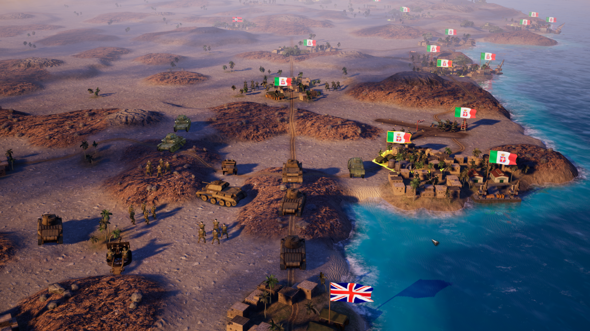
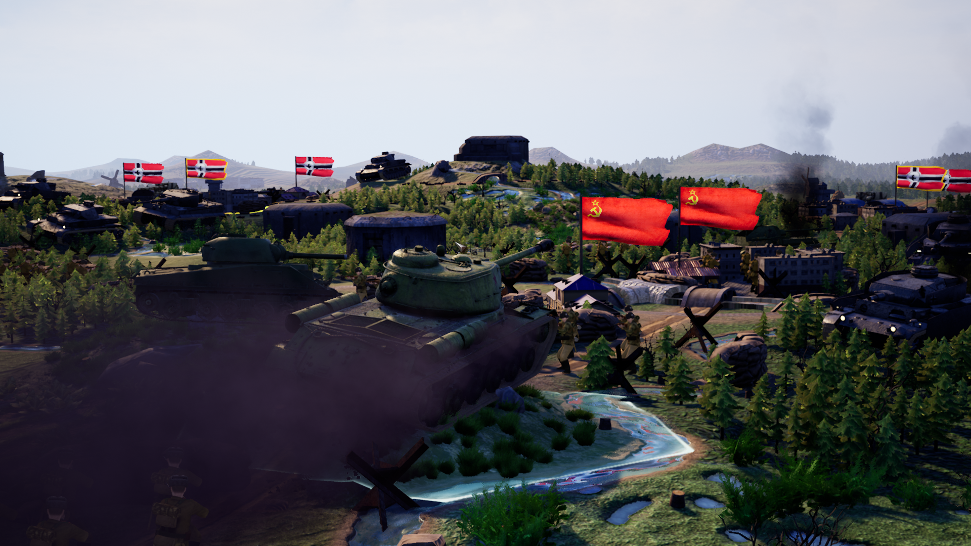
- I always appreciate when a strategy can boast atmospheric screenshots like #3 and #7. As much as strategic games are about maps and figures, many people still prefer games that let you feel "in the moment" rather than being purely schematic.
- Beautiful.
- Looks like an animated sequence? This one is confusing. Because there is no grid.
- This shot looks very Indie. Some people like that, some people don't.
- Not a fan sadly. It looks without UI like it's just a image where we arrive into, when departing from a cut-scene.

4. Equipment UI type of screenshot:

Likes: 9
Quotes:
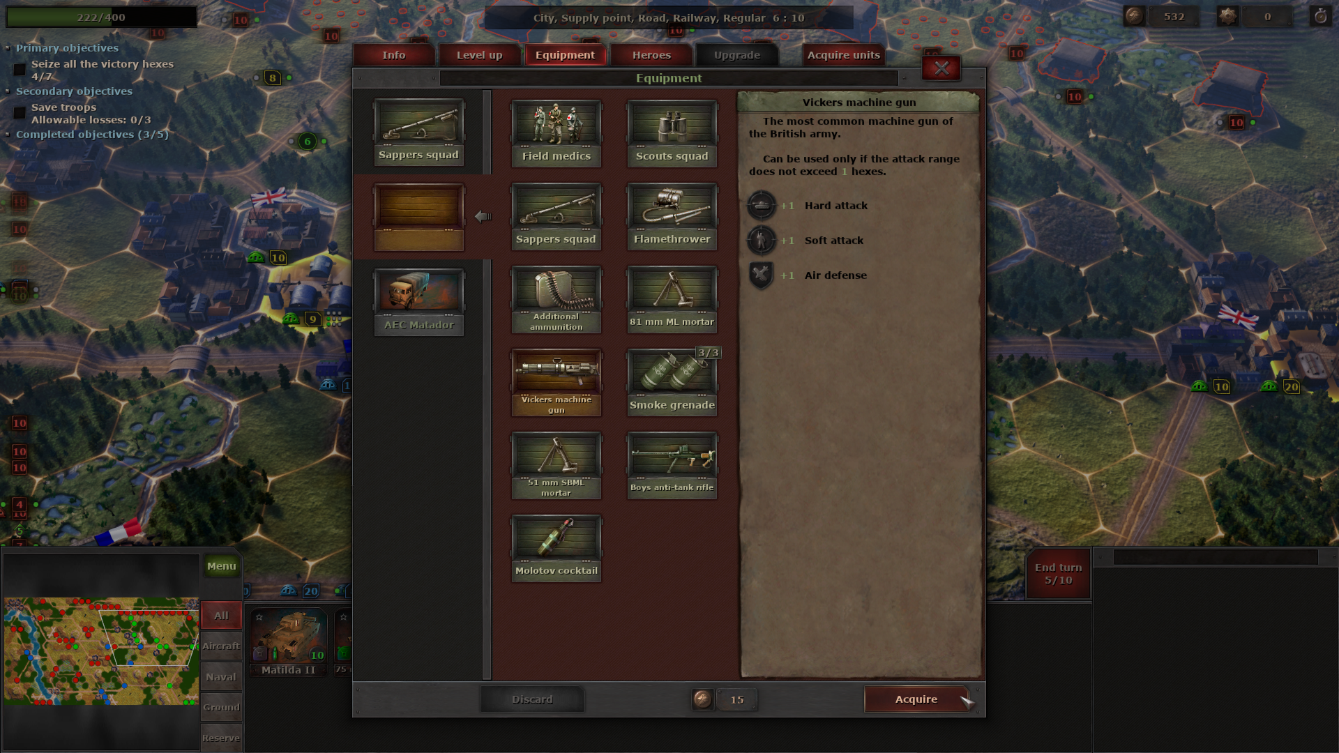
- This is really good and helpful picture! It shows you have plenty of options to customize your units (and their secondary roles due to it).
- I think #4 is a great UI screenshot - it's not too simplistic like basic overlay, and it looks like it's well-readable.
- I like your efforts to customize units with skill upgrades, special equipment addition, etc. as it can be seen in Picture Number 4.
- I can't read or undestand that info so I wouldn't use that one.
- Obligatory "under the hood" shot, but a good one, I think. Gotta let people know that there is depth to be found here and this pic does it.

5. Battlefield view with UI and without hexes type of screenshot:

Likes: 15
Quotes:
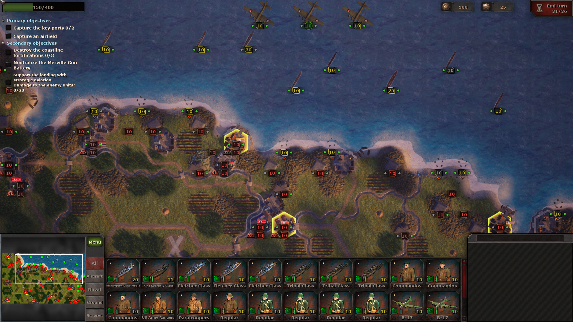
- From my point of view 7 and 5, this gives me more information about features of the game, such as the grid system, the types of buildings in the game, as well as these are the most atmospheric pictures for my taste
- I liked 5 the most. Not too less, and bot too much information clustered at one spot.
- Seems to be another good shot of the game.
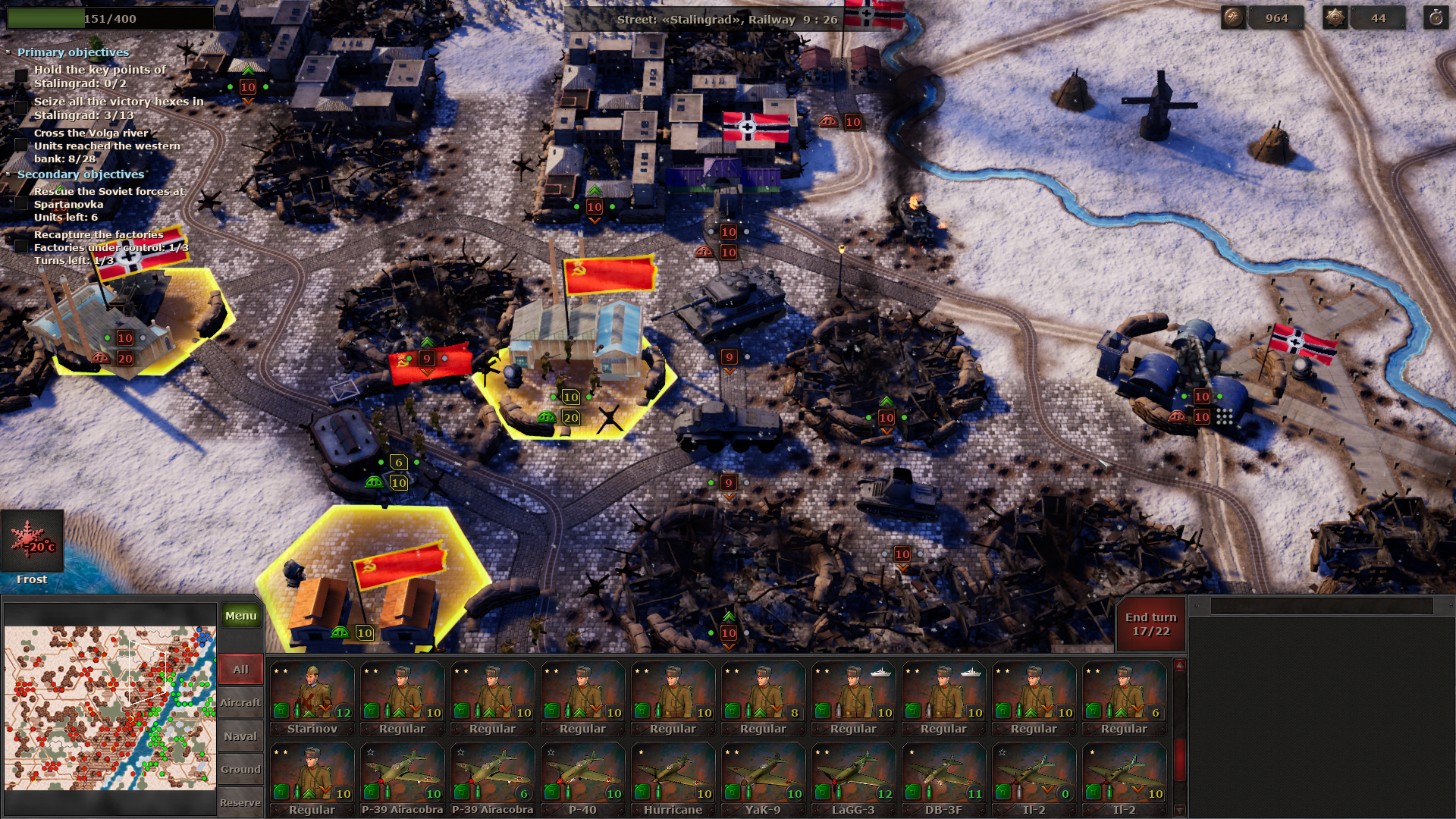
- Show me exactly what kind of game this is.
- This pic covers what you'll be seeing most of the time, I believe, and that's important. A great "first-impression" shot. I would lead with this one.
- Might suggest injecting the mouse cursor, showing some highlighted units or something, show me a little more of how the game works.

6. Close up units view type of screenshot:

Likes: 8
Quotes:
- I'd probably go for looking up close and detailed like in 6.
- I wouldn't use that, doesn't seem like the game you will be playing.
- Pretty but not something I care about. Some others would though!
- In your provided examples the 2 and 6 ones really call out to me.
- Graphic quality is not the most important for hardcore and veteran players (if we have played with prehistoric 3D graphics of "Alone in the dark" or "Colonization" pixels we can play everything) but for casual players and young people it could be a decisive factor so you should include some screenshots like Picture Number 6 showing units closely with zoom to satisfy these people expectations about graphics.

7. Battlefield view with No UI and with hexes type of screenshot:

Likes: 19
Quotes:
- Me personally I like screenshot 7 the most:
1) it shows (at least that's what I assume) where your game camera is mostly focused;
2) It looks pretty polished and clean (not to much the viewer can focus on);
3) Would be a good image to place a logo on top or something.
- Image 7 makes the game look best imo.
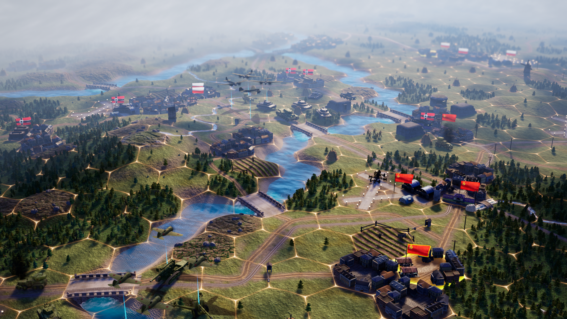
- I think this is my favorite. Another grand-scale pic showing the expanse of the map, along with the grids on the ground showing me a little bit of how the game works and a tiny piece of what to expect. This one makes me want to try the game.
- This should be your lead off shot IMO.
- 7.
- 7 looks the most attractive for me.
- I like the 5th one and the 7th.
- Is really nice screen shot, even for one without an UI. It's atmospheric. It shows more nations than one (telling that there's a chance to fight more than just Germans/Soviets!) And in general looks good, but it probably better to let fans take these ones than to have at a store front?

8. Battlefield view with UI and without hexes type of screenshot

Likes: 10
Quotes:
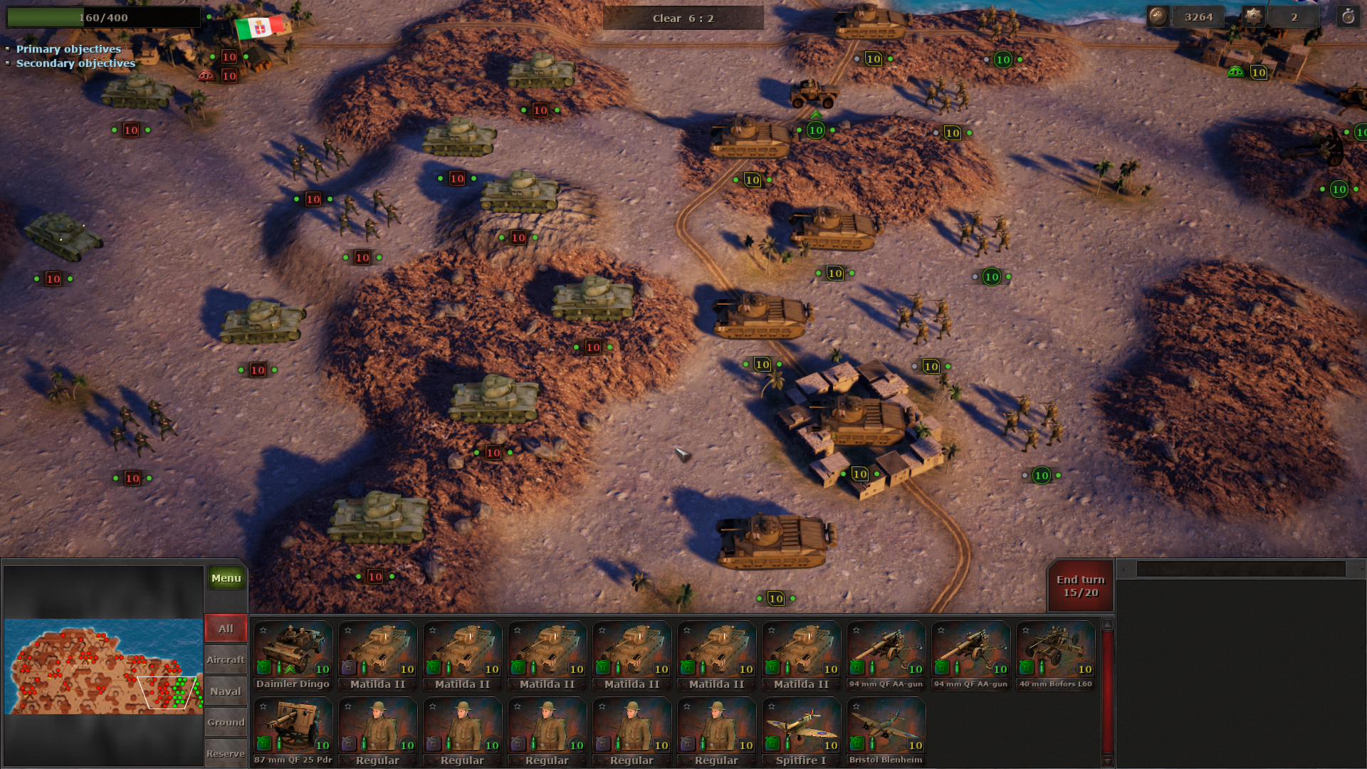
- Looks like how you'll be playing most of the game?
- This one shows exactly what type of game it is with a little extra complexity.
- This image is way too early taken. Everything is in their static starting positions and it looks more like a chess game than how the game plays. Please let at-least one turn be done before screen-shots as it looks more like a staring match than an active battlefield.

Please, let us know what you think about this whole discussion. Do you agree with the fellow players?
Is there any screenshot type that is really needed but is missing from our selection? Looking forward to further discussion.

Starni Games team

Strategic Mind: Spectre of Communism - KateMels
Hello, guys!

Last week we asked for your thoughts about the best fitting Store page screenshots types for the upcoming game Strategic Mind: Spirit of Liberty. We were pleasantly surprised by the amount of feedback we got. You have provided a detailed analysis of existing screenshots for previous Strategic Mind titles' and useful ideas for future screenshots. As developers, sometimes it is hard for us to see the game through the players' eyes, so your feedback is invaluable for us. Now we want to believe that we understand you a little bit better. So we appreciate all of your efforts, guys! We will try to heed your advice when working on the Strategic Mind: Spirit of Liberty screenshots revamp soon, as we now have more materials for them.

We want to share with you some quotes from the community on Steam and on Reddit about the Strategic Mind screenshots. Maybe it would be interesting for you to read and compare your ideas with the other players' perceptions, or even find your own commentary here:

1. Zoomed-out strategic view type of screenshot:

Likes: 5
Quotes:
-I like #1 - it shows a strategic view or something like that? I like to know what kind of tools a strategic game offers.
- The first one should be a little less zoomed out
- Looks like a different game.
- Don’t highlight interesting parts of the game.
- #1 is lovely. it shows you can have different combat arms of the army (air, navy, land/marine), and shows you can have more than just tiny snippet of forces.

2. HQ room type of screenshot:

Likes: 9
Quotes:
- #2 is something I would not appreciate on a strategy game page. That's a neat visual for a menu but that's not what I'm going to actually play, so it's kind of just noise.
- I'd avoid anything like 2. that sort of stuff could just be done with photo likeness written dialogue like other games have handled it.

I know it seems like some sort of special feature of these games but for me personally it is a put off a bit as I'm more interested in the challenge of the scenarios or the campaign than wading through some sort of' 'marionette' cut scene where a simple military style 'old school' dossier of the assignment or objective would be more immersive if done authentically maybe with a voice over like some game leaders in this field have done in the past because it's efficient for the player and adds enough immersion to get to the 'real' game
- Some people are looking for fast-casual playing similar to multiplayer game but many other people when play a single player campaign don't want just a chain of battles with a poor and forgetable introduction between them. They look for a full story and want to "make the difference" with their choices and actions. On the other hand, most games just show an "intro video" and a final "victory video". I love the work you made to create a screenplay and a background to connect every battle and the consecuences of the previous clashes like the image of Picture Number 2 and the mini-videos between battles. Screenshots should reflect that your game is more than a chain of battles with an "excuse-plot".
- Looks interesting, Using that would be good.
- I love this shot. Shows that there is more to the game than just standard RTS fare and clicking/moving units.
- Great, but maybe highlight the campaign map though instead of a general.
- I think this kind of image should always be included to the screenshots. Player spends a lot of time in this room, so it should at-least be represented (also it would remind the player that it's mostly story-driven).

3. Battlefield view with No UI and No hexes type of screenshot:

Likes: 7
Quotes:
- I always appreciate when a strategy can boast atmospheric screenshots like #3 and #7. As much as strategic games are about maps and figures, many people still prefer games that let you feel "in the moment" rather than being purely schematic.
- Beautiful.
- Looks like an animated sequence? This one is confusing. Because there is no grid.
- This shot looks very Indie. Some people like that, some people don't.
- Not a fan sadly. It looks without UI like it's just a image where we arrive into, when departing from a cut-scene.

4. Equipment UI type of screenshot:

Likes: 9
Quotes:
- This is really good and helpful picture! It shows you have plenty of options to customize your units (and their secondary roles due to it).
- I think #4 is a great UI screenshot - it's not too simplistic like basic overlay, and it looks like it's well-readable.
- I like your efforts to customize units with skill upgrades, special equipment addition, etc. as it can be seen in Picture Number 4.
- I can't read or undestand that info so I wouldn't use that one.
- Obligatory "under the hood" shot, but a good one, I think. Gotta let people know that there is depth to be found here and this pic does it.

5. Battlefield view with UI and without hexes type of screenshot:

Likes: 15
Quotes:
- From my point of view 7 and 5, this gives me more information about features of the game, such as the grid system, the types of buildings in the game, as well as these are the most atmospheric pictures for my taste
- I liked 5 the most. Not too less, and bot too much information clustered at one spot.
- Seems to be another good shot of the game.
- Show me exactly what kind of game this is.
- This pic covers what you'll be seeing most of the time, I believe, and that's important. A great "first-impression" shot. I would lead with this one.
- Might suggest injecting the mouse cursor, showing some highlighted units or something, show me a little more of how the game works.

6. Close up units view type of screenshot:

Likes: 8
Quotes:
- I'd probably go for looking up close and detailed like in 6.
- I wouldn't use that, doesn't seem like the game you will be playing.
- Pretty but not something I care about. Some others would though!
- In your provided examples the 2 and 6 ones really call out to me.
- Graphic quality is not the most important for hardcore and veteran players (if we have played with prehistoric 3D graphics of "Alone in the dark" or "Colonization" pixels we can play everything) but for casual players and young people it could be a decisive factor so you should include some screenshots like Picture Number 6 showing units closely with zoom to satisfy these people expectations about graphics.

7. Battlefield view with No UI and with hexes type of screenshot:

Likes: 19
Quotes:
- Me personally I like screenshot 7 the most:
1) it shows (at least that's what I assume) where your game camera is mostly focused;
2) It looks pretty polished and clean (not to much the viewer can focus on);
3) Would be a good image to place a logo on top or something.
- Image 7 makes the game look best imo.
- I think this is my favorite. Another grand-scale pic showing the expanse of the map, along with the grids on the ground showing me a little bit of how the game works and a tiny piece of what to expect. This one makes me want to try the game.
- This should be your lead off shot IMO.
- 7.
- 7 looks the most attractive for me.
- I like the 5th one and the 7th.
- Is really nice screen shot, even for one without an UI. It's atmospheric. It shows more nations than one (telling that there's a chance to fight more than just Germans/Soviets!) And in general looks good, but it probably better to let fans take these ones than to have at a store front?

8. Battlefield view with UI and without hexes type of screenshot

Likes: 10
Quotes:
- Looks like how you'll be playing most of the game?
- This one shows exactly what type of game it is with a little extra complexity.
- This image is way too early taken. Everything is in their static starting positions and it looks more like a chess game than how the game plays. Please let at-least one turn be done before screen-shots as it looks more like a staring match than an active battlefield.

Please, let us know what you think about this whole discussion. Do you agree with the fellow players?
Is there any screenshot type that is really needed but is missing from our selection? Looking forward to further discussion.

Starni Games team

Strategic Mind: Blitzkrieg - KateMels
Hello, guys!

Last week we asked for your thoughts about the best fitting Store page screenshots types for the upcoming game Strategic Mind: Spirit of Liberty. We were pleasantly surprised by the amount of feedback we got. You have provided a detailed analysis of existing screenshots for previous Strategic Mind titles' and useful ideas for future screenshots. As developers, sometimes it is hard for us to see the game through the players' eyes, so your feedback is invaluable for us. Now we want to believe that we understand you a little bit better. So we appreciate all of your efforts, guys! We will try to heed your advice when working on the Strategic Mind: Spirit of Liberty screenshots revamp soon, as we now have more materials for them.

We want to share with you some quotes from the community on Steam and on Reddit about the Strategic Mind screenshots. Maybe it would be interesting for you to read and compare your ideas with the other players' perceptions, or even find your own commentary here:

1. Zoomed-out strategic view type of screenshot:

Likes: 5
Quotes:
-I like #1 - it shows a strategic view or something like that? I like to know what kind of tools a strategic game offers.
- The first one should be a little less zoomed out
- Looks like a different game.
- Don’t highlight interesting parts of the game.
- #1 is lovely. it shows you can have different combat arms of the army (air, navy, land/marine), and shows you can have more than just tiny snippet of forces.

2. HQ room type of screenshot:

Likes: 9
Quotes:
- #2 is something I would not appreciate on a strategy game page. That's a neat visual for a menu but that's not what I'm going to actually play, so it's kind of just noise.
- I'd avoid anything like 2. that sort of stuff could just be done with photo likeness written dialogue like other games have handled it.

I know it seems like some sort of special feature of these games but for me personally it is a put off a bit as I'm more interested in the challenge of the scenarios or the campaign than wading through some sort of' 'marionette' cut scene where a simple military style 'old school' dossier of the assignment or objective would be more immersive if done authentically maybe with a voice over like some game leaders in this field have done in the past because it's efficient for the player and adds enough immersion to get to the 'real' game
- Some people are looking for fast-casual playing similar to multiplayer game but many other people when play a single player campaign don't want just a chain of battles with a poor and forgetable introduction between them. They look for a full story and want to "make the difference" with their choices and actions. On the other hand, most games just show an "intro video" and a final "victory video". I love the work you made to create a screenplay and a background to connect every battle and the consecuences of the previous clashes like the image of Picture Number 2 and the mini-videos between battles. Screenshots should reflect that your game is more than a chain of battles with an "excuse-plot".
- Looks interesting, Using that would be good.
- I love this shot. Shows that there is more to the game than just standard RTS fare and clicking/moving units.
- Great, but maybe highlight the campaign map though instead of a general.
- I think this kind of image should always be included to the screenshots. Player spends a lot of time in this room, so it should at-least be represented (also it would remind the player that it's mostly story-driven).

3. Battlefield view with No UI and No hexes type of screenshot:

Likes: 7
Quotes:
- I always appreciate when a strategy can boast atmospheric screenshots like #3 and #7. As much as strategic games are about maps and figures, many people still prefer games that let you feel "in the moment" rather than being purely schematic.
- Beautiful.
- Looks like an animated sequence? This one is confusing. Because there is no grid.
- This shot looks very Indie. Some people like that, some people don't.
- Not a fan sadly. It looks without UI like it's just a image where we arrive into, when departing from a cut-scene.

4. Equipment UI type of screenshot:

Likes: 9
Quotes:
- This is really good and helpful picture! It shows you have plenty of options to customize your units (and their secondary roles due to it).
- I think #4 is a great UI screenshot - it's not too simplistic like basic overlay, and it looks like it's well-readable.
- I like your efforts to customize units with skill upgrades, special equipment addition, etc. as it can be seen in Picture Number 4.
- I can't read or undestand that info so I wouldn't use that one.
- Obligatory "under the hood" shot, but a good one, I think. Gotta let people know that there is depth to be found here and this pic does it.

5. Battlefield view with UI and without hexes type of screenshot:

Likes: 15
Quotes:
- From my point of view 7 and 5, this gives me more information about features of the game, such as the grid system, the types of buildings in the game, as well as these are the most atmospheric pictures for my taste
- I liked 5 the most. Not too less, and bot too much information clustered at one spot.
- Seems to be another good shot of the game.
- Show me exactly what kind of game this is.
- This pic covers what you'll be seeing most of the time, I believe, and that's important. A great "first-impression" shot. I would lead with this one.
- Might suggest injecting the mouse cursor, showing some highlighted units or something, show me a little more of how the game works.

6. Close up units view type of screenshot:

Likes: 8
Quotes:
- I'd probably go for looking up close and detailed like in 6.
- I wouldn't use that, doesn't seem like the game you will be playing.
- Pretty but not something I care about. Some others would though!
- In your provided examples the 2 and 6 ones really call out to me.
- Graphic quality is not the most important for hardcore and veteran players (if we have played with prehistoric 3D graphics of "Alone in the dark" or "Colonization" pixels we can play everything) but for casual players and young people it could be a decisive factor so you should include some screenshots like Picture Number 6 showing units closely with zoom to satisfy these people expectations about graphics.

7. Battlefield view with No UI and with hexes type of screenshot:

Likes: 19
Quotes:
- Me personally I like screenshot 7 the most:
1) it shows (at least that's what I assume) where your game camera is mostly focused;
2) It looks pretty polished and clean (not to much the viewer can focus on);
3) Would be a good image to place a logo on top or something.
- Image 7 makes the game look best imo.
- I think this is my favorite. Another grand-scale pic showing the expanse of the map, along with the grids on the ground showing me a little bit of how the game works and a tiny piece of what to expect. This one makes me want to try the game.
- This should be your lead off shot IMO.
- 7.
- 7 looks the most attractive for me.
- I like the 5th one and the 7th.
- Is really nice screen shot, even for one without an UI. It's atmospheric. It shows more nations than one (telling that there's a chance to fight more than just Germans/Soviets!) And in general looks good, but it probably better to let fans take these ones than to have at a store front?

8. Battlefield view with UI and without hexes type of screenshot

Likes: 10
Quotes:
- Looks like how you'll be playing most of the game?
- This one shows exactly what type of game it is with a little extra complexity.
- This image is way too early taken. Everything is in their static starting positions and it looks more like a chess game than how the game plays. Please let at-least one turn be done before screen-shots as it looks more like a staring match than an active battlefield.

Please, let us know what you think about this whole discussion. Do you agree with the fellow players?
Is there any screenshot type that is really needed but is missing from our selection? Looking forward to further discussion.

Starni Games team

Panzer Strategy - KateMels
Hello, guys!

Last week we asked for your thoughts about the best fitting Store page screenshots types for the upcoming game Strategic Mind: Spirit of Liberty. We were pleasantly surprised by the amount of feedback we got. You have provided a detailed analysis of existing screenshots for previous Strategic Mind titles' and useful ideas for future screenshots. As developers, sometimes it is hard for us to see the game through the players' eyes, so your feedback is invaluable for us. Now we want to believe that we understand you a little bit better. So we appreciate all of your efforts, guys! We will try to heed your advice when working on the Strategic Mind: Spirit of Liberty screenshots revamp soon, as we now have more materials for them.

We want to share with you some quotes from the community on Steam and on Reddit about the Strategic Mind screenshots. Maybe it would be interesting for you to read and compare your ideas with the other players' perceptions, or even find your own commentary here:

1. Zoomed-out strategic view type of screenshot:

Likes: 5
Quotes:
-I like #1 - it shows a strategic view or something like that? I like to know what kind of tools a strategic game offers.
- The first one should be a little less zoomed out
- Looks like a different game.
- Don’t highlight interesting parts of the game.
- #1 is lovely. it shows you can have different combat arms of the army (air, navy, land/marine), and shows you can have more than just tiny snippet of forces.

2. HQ room type of screenshot:

Likes: 9
Quotes:
- #2 is something I would not appreciate on a strategy game page. That's a neat visual for a menu but that's not what I'm going to actually play, so it's kind of just noise.
- I'd avoid anything like 2. that sort of stuff could just be done with photo likeness written dialogue like other games have handled it.

I know it seems like some sort of special feature of these games but for me personally it is a put off a bit as I'm more interested in the challenge of the scenarios or the campaign than wading through some sort of' 'marionette' cut scene where a simple military style 'old school' dossier of the assignment or objective would be more immersive if done authentically maybe with a voice over like some game leaders in this field have done in the past because it's efficient for the player and adds enough immersion to get to the 'real' game
- Some people are looking for fast-casual playing similar to multiplayer game but many other people when play a single player campaign don't want just a chain of battles with a poor and forgetable introduction between them. They look for a full story and want to "make the difference" with their choices and actions. On the other hand, most games just show an "intro video" and a final "victory video". I love the work you made to create a screenplay and a background to connect every battle and the consecuences of the previous clashes like the image of Picture Number 2 and the mini-videos between battles. Screenshots should reflect that your game is more than a chain of battles with an "excuse-plot".
- Looks interesting, Using that would be good.
- I love this shot. Shows that there is more to the game than just standard RTS fare and clicking/moving units.
- Great, but maybe highlight the campaign map though instead of a general.
- I think this kind of image should always be included to the screenshots. Player spends a lot of time in this room, so it should at-least be represented (also it would remind the player that it's mostly story-driven).

3. Battlefield view with No UI and No hexes type of screenshot:

Likes: 7
Quotes:
- I always appreciate when a strategy can boast atmospheric screenshots like #3 and #7. As much as strategic games are about maps and figures, many people still prefer games that let you feel "in the moment" rather than being purely schematic.
- Beautiful.
- Looks like an animated sequence? This one is confusing. Because there is no grid.
- This shot looks very Indie. Some people like that, some people don't.
- Not a fan sadly. It looks without UI like it's just a image where we arrive into, when departing from a cut-scene.

4. Equipment UI type of screenshot:

Likes: 9
Quotes:
- This is really good and helpful picture! It shows you have plenty of options to customize your units (and their secondary roles due to it).
- I think #4 is a great UI screenshot - it's not too simplistic like basic overlay, and it looks like it's well-readable.
- I like your efforts to customize units with skill upgrades, special equipment addition, etc. as it can be seen in Picture Number 4.
- I can't read or undestand that info so I wouldn't use that one.
- Obligatory "under the hood" shot, but a good one, I think. Gotta let people know that there is depth to be found here and this pic does it.

5. Battlefield view with UI and without hexes type of screenshot:

Likes: 15
Quotes:
- From my point of view 7 and 5, this gives me more information about features of the game, such as the grid system, the types of buildings in the game, as well as these are the most atmospheric pictures for my taste
- I liked 5 the most. Not too less, and bot too much information clustered at one spot.
- Seems to be another good shot of the game.
- Show me exactly what kind of game this is.
- This pic covers what you'll be seeing most of the time, I believe, and that's important. A great "first-impression" shot. I would lead with this one.
- Might suggest injecting the mouse cursor, showing some highlighted units or something, show me a little more of how the game works.

6. Close up units view type of screenshot:

Likes: 8
Quotes:
- I'd probably go for looking up close and detailed like in 6.
- I wouldn't use that, doesn't seem like the game you will be playing.
- Pretty but not something I care about. Some others would though!
- In your provided examples the 2 and 6 ones really call out to me.
- Graphic quality is not the most important for hardcore and veteran players (if we have played with prehistoric 3D graphics of "Alone in the dark" or "Colonization" pixels we can play everything) but for casual players and young people it could be a decisive factor so you should include some screenshots like Picture Number 6 showing units closely with zoom to satisfy these people expectations about graphics.

7. Battlefield view with No UI and with hexes type of screenshot:

Likes: 19
Quotes:
- Me personally I like screenshot 7 the most:
1) it shows (at least that's what I assume) where your game camera is mostly focused;
2) It looks pretty polished and clean (not to much the viewer can focus on);
3) Would be a good image to place a logo on top or something.
- Image 7 makes the game look best imo.
- I think this is my favorite. Another grand-scale pic showing the expanse of the map, along with the grids on the ground showing me a little bit of how the game works and a tiny piece of what to expect. This one makes me want to try the game.
- This should be your lead off shot IMO.
- 7.
- 7 looks the most attractive for me.
- I like the 5th one and the 7th.
- Is really nice screen shot, even for one without an UI. It's atmospheric. It shows more nations than one (telling that there's a chance to fight more than just Germans/Soviets!) And in general looks good, but it probably better to let fans take these ones than to have at a store front?

8. Battlefield view with UI and without hexes type of screenshot

Likes: 10
Quotes:
- Looks like how you'll be playing most of the game?
- This one shows exactly what type of game it is with a little extra complexity.
- This image is way too early taken. Everything is in their static starting positions and it looks more like a chess game than how the game plays. Please let at-least one turn be done before screen-shots as it looks more like a staring match than an active battlefield.

Please, let us know what you think about this whole discussion. Do you agree with the fellow players?
Is there any screenshot type that is really needed but is missing from our selection? Looking forward to further discussion.

Starni Games team

Strategic Mind: Spirit of Liberty - Prologue 1939 - KateMels
Hello, guys!

Last week we asked for your thoughts about the best fitting Store page screenshots types for the upcoming game Strategic Mind: Spirit of Liberty. We were pleasantly surprised by the amount of feedback we got. You have provided a detailed analysis of existing screenshots for previous Strategic Mind titles' and useful ideas for future screenshots. As developers, sometimes it is hard for us to see the game through the players' eyes, so your feedback is invaluable for us. Now we want to believe that we understand you a little bit better. So we appreciate all of your efforts, guys! We will try to heed your advice when working on the Strategic Mind: Spirit of Liberty screenshots revamp soon, as we now have more materials for them.

We want to share with you some quotes from the community on Steam and on Reddit about the Strategic Mind screenshots. Maybe it would be interesting for you to read and compare your ideas with the other players' perceptions, or even find your own commentary here:

1. Zoomed-out strategic view type of screenshot:

Likes: 5
Quotes:
-I like #1 - it shows a strategic view or something like that? I like to know what kind of tools a strategic game offers.
- The first one should be a little less zoomed out
- Looks like a different game.
- Don’t highlight interesting parts of the game.
- #1 is lovely. it shows you can have different combat arms of the army (air, navy, land/marine), and shows you can have more than just tiny snippet of forces.

2. HQ room type of screenshot:

Likes: 9
Quotes:
- #2 is something I would not appreciate on a strategy game page. That's a neat visual for a menu but that's not what I'm going to actually play, so it's kind of just noise.
- I'd avoid anything like 2. that sort of stuff could just be done with photo likeness written dialogue like other games have handled it.

I know it seems like some sort of special feature of these games but for me personally it is a put off a bit as I'm more interested in the challenge of the scenarios or the campaign than wading through some sort of' 'marionette' cut scene where a simple military style 'old school' dossier of the assignment or objective would be more immersive if done authentically maybe with a voice over like some game leaders in this field have done in the past because it's efficient for the player and adds enough immersion to get to the 'real' game
- Some people are looking for fast-casual playing similar to multiplayer game but many other people when play a single player campaign don't want just a chain of battles with a poor and forgetable introduction between them. They look for a full story and want to "make the difference" with their choices and actions. On the other hand, most games just show an "intro video" and a final "victory video". I love the work you made to create a screenplay and a background to connect every battle and the consecuences of the previous clashes like the image of Picture Number 2 and the mini-videos between battles. Screenshots should reflect that your game is more than a chain of battles with an "excuse-plot".
- Looks interesting, Using that would be good.
- I love this shot. Shows that there is more to the game than just standard RTS fare and clicking/moving units.
- Great, but maybe highlight the campaign map though instead of a general.
- I think this kind of image should always be included to the screenshots. Player spends a lot of time in this room, so it should at-least be represented (also it would remind the player that it's mostly story-driven).

3. Battlefield view with No UI and No hexes type of screenshot:

Likes: 7
Quotes:
- I always appreciate when a strategy can boast atmospheric screenshots like #3 and #7. As much as strategic games are about maps and figures, many people still prefer games that let you feel "in the moment" rather than being purely schematic.
- Beautiful.
- Looks like an animated sequence? This one is confusing. Because there is no grid.
- This shot looks very Indie. Some people like that, some people don't.
- Not a fan sadly. It looks without UI like it's just a image where we arrive into, when departing from a cut-scene.

4. Equipment UI type of screenshot:

Likes: 9
Quotes:
- This is really good and helpful picture! It shows you have plenty of options to customize your units (and their secondary roles due to it).
- I think #4 is a great UI screenshot - it's not too simplistic like basic overlay, and it looks like it's well-readable.
- I like your efforts to customize units with skill upgrades, special equipment addition, etc. as it can be seen in Picture Number 4.
- I can't read or undestand that info so I wouldn't use that one.
- Obligatory "under the hood" shot, but a good one, I think. Gotta let people know that there is depth to be found here and this pic does it.

5. Battlefield view with UI and without hexes type of screenshot:

Likes: 15
Quotes:
- From my point of view 7 and 5, this gives me more information about features of the game, such as the grid system, the types of buildings in the game, as well as these are the most atmospheric pictures for my taste
- I liked 5 the most. Not too less, and bot too much information clustered at one spot.
- Seems to be another good shot of the game.
- Show me exactly what kind of game this is.
- This pic covers what you'll be seeing most of the time, I believe, and that's important. A great "first-impression" shot. I would lead with this one.
- Might suggest injecting the mouse cursor, showing some highlighted units or something, show me a little more of how the game works.

6. Close up units view type of screenshot:

Likes: 8
Quotes:
- I'd probably go for looking up close and detailed like in 6.
- I wouldn't use that, doesn't seem like the game you will be playing.
- Pretty but not something I care about. Some others would though!
- In your provided examples the 2 and 6 ones really call out to me.
- Graphic quality is not the most important for hardcore and veteran players (if we have played with prehistoric 3D graphics of "Alone in the dark" or "Colonization" pixels we can play everything) but for casual players and young people it could be a decisive factor so you should include some screenshots like Picture Number 6 showing units closely with zoom to satisfy these people expectations about graphics.

7. Battlefield view with No UI and with hexes type of screenshot:

Likes: 19
Quotes:
- Me personally I like screenshot 7 the most:
1) it shows (at least that's what I assume) where your game camera is mostly focused;
2) It looks pretty polished and clean (not to much the viewer can focus on);
3) Would be a good image to place a logo on top or something.
- Image 7 makes the game look best imo.
- I think this is my favorite. Another grand-scale pic showing the expanse of the map, along with the grids on the ground showing me a little bit of how the game works and a tiny piece of what to expect. This one makes me want to try the game.
- This should be your lead off shot IMO.
- 7.
- 7 looks the most attractive for me.
- I like the 5th one and the 7th.
- Is really nice screen shot, even for one without an UI. It's atmospheric. It shows more nations than one (telling that there's a chance to fight more than just Germans/Soviets!) And in general looks good, but it probably better to let fans take these ones than to have at a store front?

8. Battlefield view with UI and without hexes type of screenshot

Likes: 10
Quotes:
- Looks like how you'll be playing most of the game?
- This one shows exactly what type of game it is with a little extra complexity.
- This image is way too early taken. Everything is in their static starting positions and it looks more like a chess game than how the game plays. Please let at-least one turn be done before screen-shots as it looks more like a staring match than an active battlefield.

Please, let us know what you think about this whole discussion. Do you agree with the fellow players?
Is there any screenshot type that is really needed but is missing from our selection? Looking forward to further discussion.

Starni Games team

Zombie Bar Simulator - VRFACTORY
Dear Horror Bar followers!

Finally, we are providing you with quite an important Horror Bar VR update. Much obliged for all of your feedback. We try our best to catch up with all of your ideas and suggestions.

The following bugs have been successfully fixed:

1. Collision boxes improvement - the dishes you are currently preparing shouldn't randomly disappear from the counter anymore

2. Menu navigation - navigating in the menu is much more refined and user-friendly

3. Shaking drinks issue - some of you encountered issues with shaking drinks - you weren't able to pour the drink from shaker to wooden cup, so the game progress was almost impossible. It's fixed now.

4. Difficulty level re-balance - also we took care of difficulty balance. Now the game is still challenging, but much more pleasant. Try it out.

Now we are working our butts off to finish releasing Horror Bar for both Quest and PSVR and after a short break, we'll be back to new Horror Bar improvements.

LOVE. VR Factory
Hydroneer - grandmaMax
Since the news of the 2.0 delay, I've decided to work on an optimisation patch for the current version of the game. Here's some quick notes about this patch:

- This effects save files with lots of items in the world.
- Additionally please remember to use the 'Toggle Save Dirt Chunks' and 'Toggle Save Raw Resources' options in the gameplay settings menu if you have lots of dirt/resources in your base, this will help with FPS.
- This is not the 2.0 optimisations, they will be much much much better.
- This will break the Logic Extended and Pipe Extended mods, please remove these before playing. I'm going to be working with the mod developers to get these fixed asap.

Enjoy the optimisations! Look out for our next dev vlog on YouTube (link below) on Oct 5th for news about the new range of house building parts!
If you're enjoying Hydroneer please consider leaving a Steam review... It really helps us out!
-grandmaMax

Our YouTube:
https://www.youtube.com/c/FoulballHangover
...