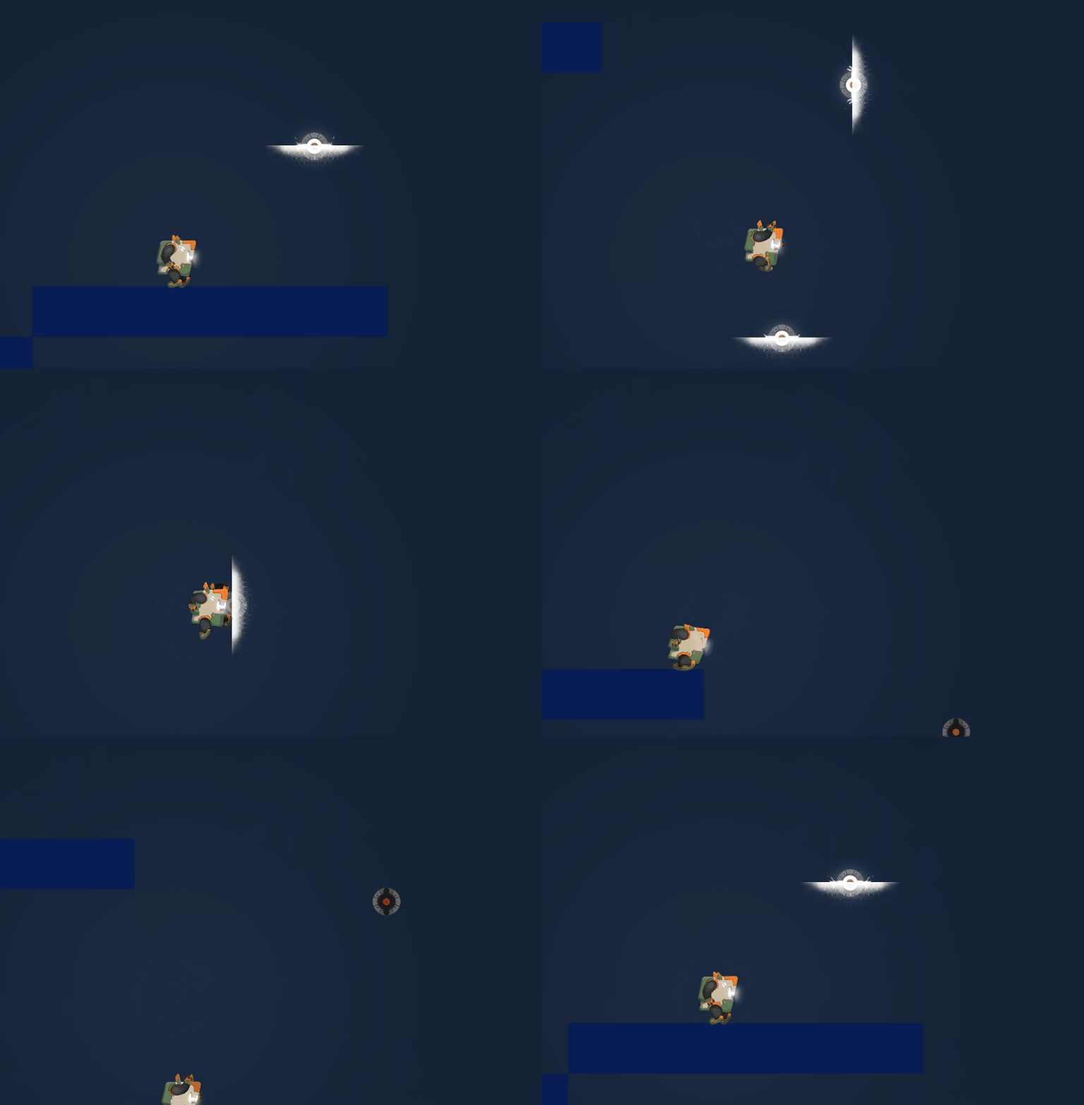
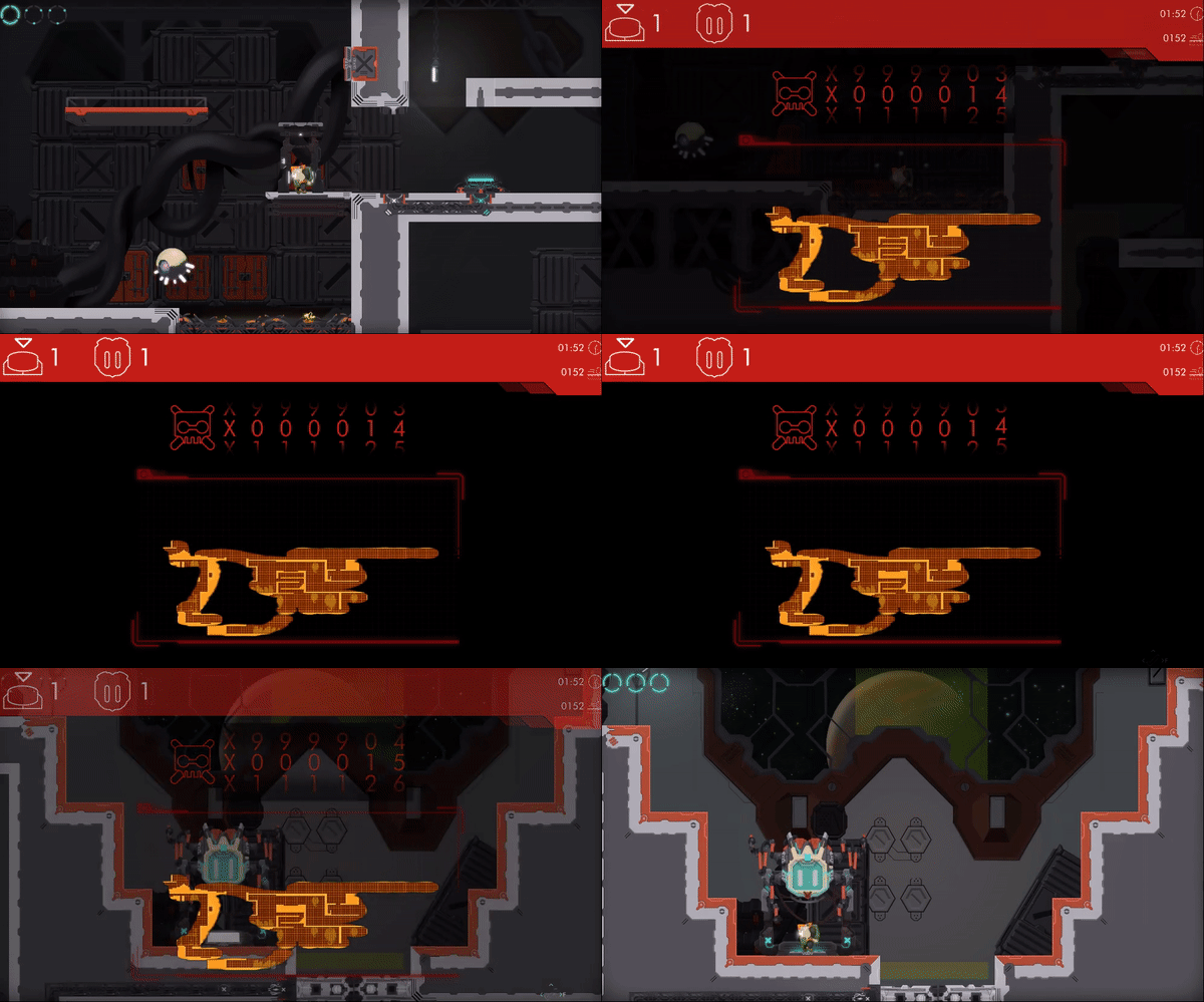
A new devlog is finally online, this time we go a little meta, talking about some issues we are having on the med area. But we still end up with lasers, and who doesn't like a lot of them xDDD.
Next week we plan to finally complete all the med area enemies and mechanics so stay tuned for more news, here or on any of our social media channels ;)
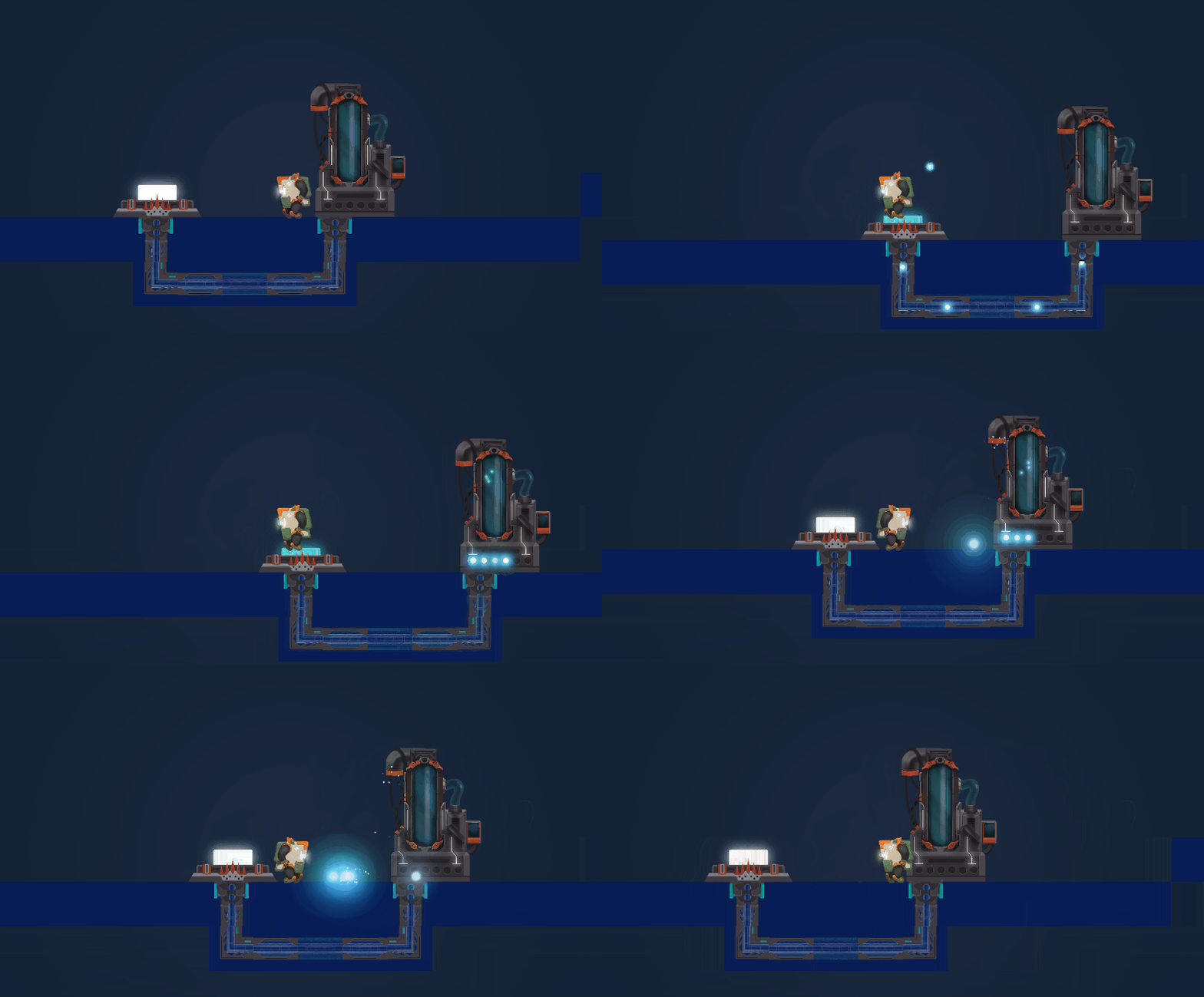
After a skipped week Oirbo devlog is back! This time we reveal the new look and feel of the medical area, some new cool art that we've done for Astral Oirbo and the medical area "spikes" and we cap it off with the usual level design progress gif, so go check it!.
Hi guys, Last week were all about finalizing some of the main mechanics of the ongoing med area, we finalized the Anesthesiologist Robo and the new health draining button, you can read all about it on our blog!
Hi guys, Coming from one of the most productive weeks so far on Oirbo, we talk about the new design, the new enemy and the new button that we worked all week on the latest devlog!
This week we are aiming to polish the new enemy, and continuing working on the floor plan and level design of the medical area, so stay tuned!
As usual a big thanks for all the feedback and help that you guys are giving us!
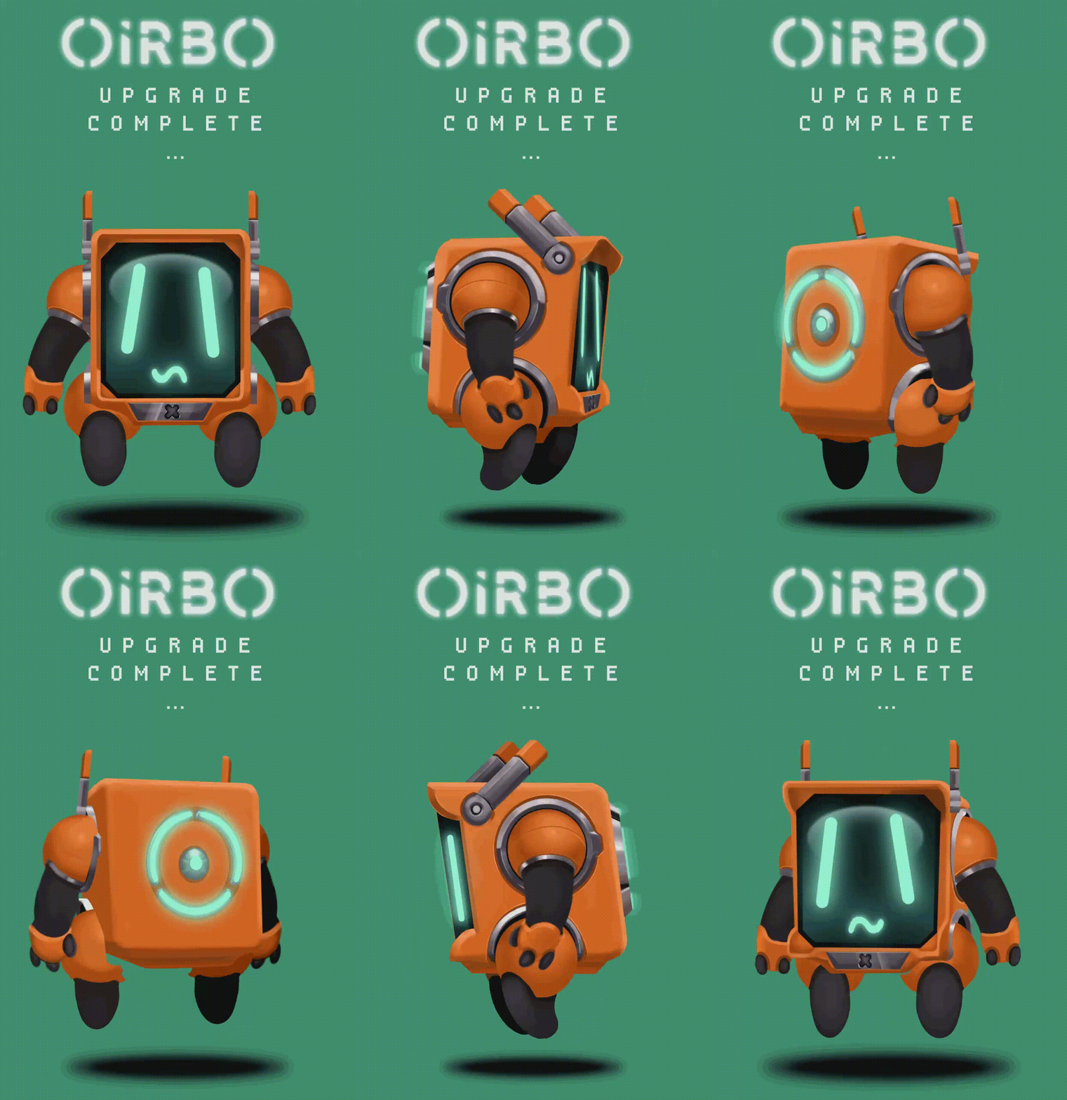
This time we do a review of what we've been doing for the past 2 weeks, mainly a lot of level design and the creation of the new mechanic Astral Oirbo (the one you see in the gif above).
Now for this week, we will tackle the all so important anesthesiologist, a kind of mini-boss that will be present across the medic area, and the button mechanic for this area.
As usual a big thanks for all the feedback and help that you guys are giving us!
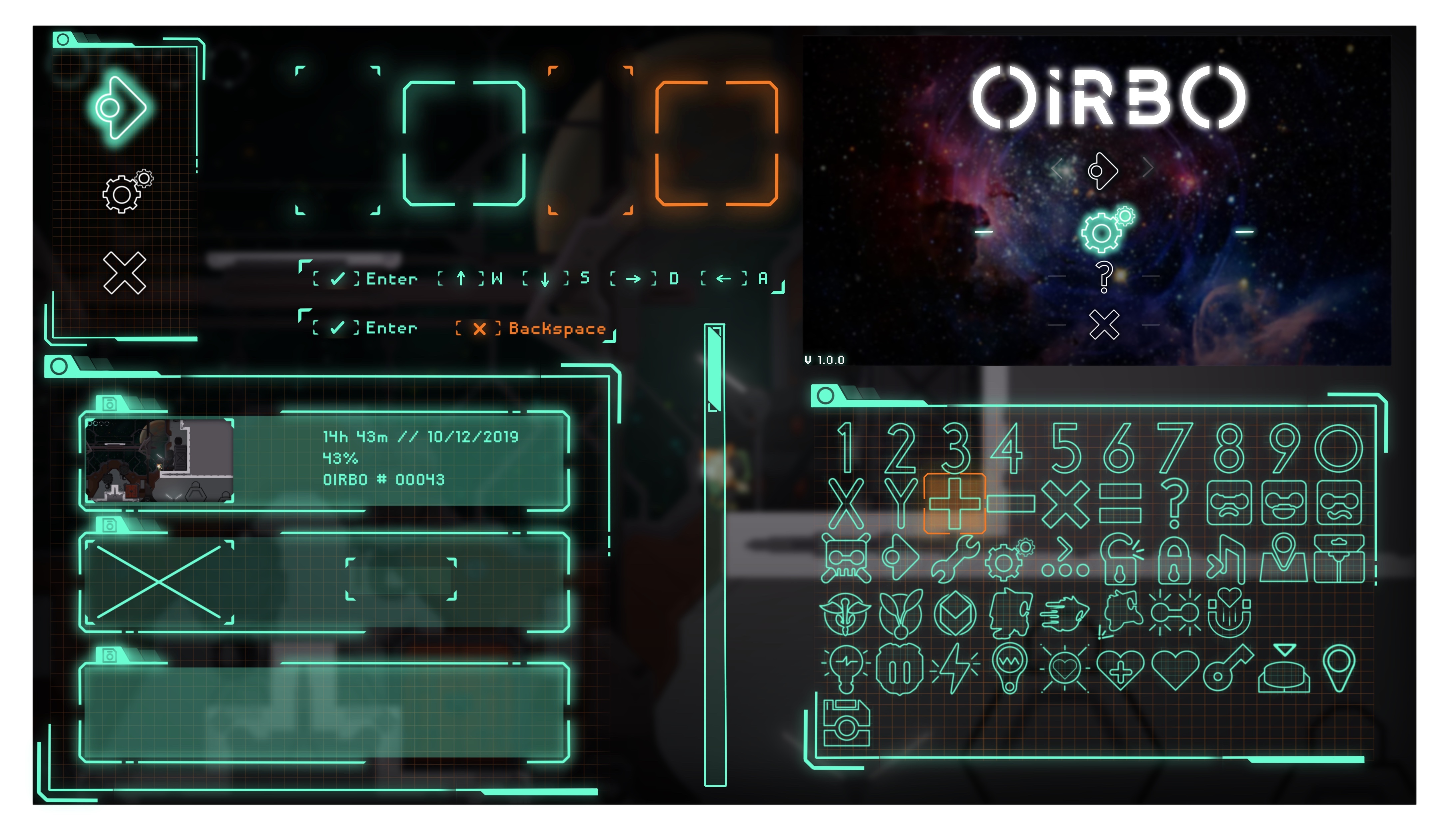
Hi guys! Last week we finally ended the first version of Oirbo User Interface \o/.
With it, we got a huge motivation boost from it and we are finally ready to tackle the new area! It's been a few months since we added actual content to the game so we are super eager to start but first will fix some loose ends on our engine.
The devlog is as usual on our blog, feel free to read it and let us know on your thoughts of the UI ;)
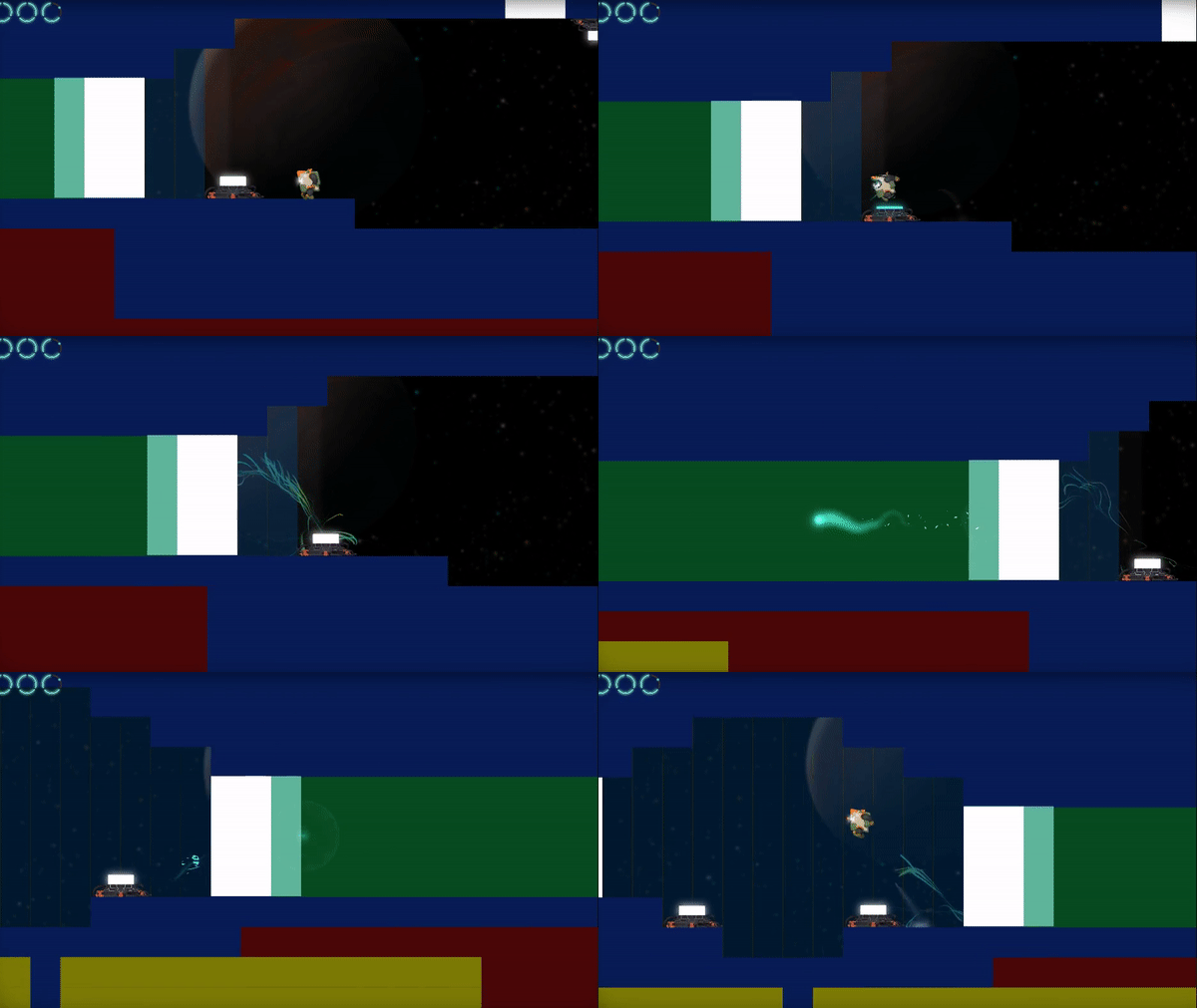
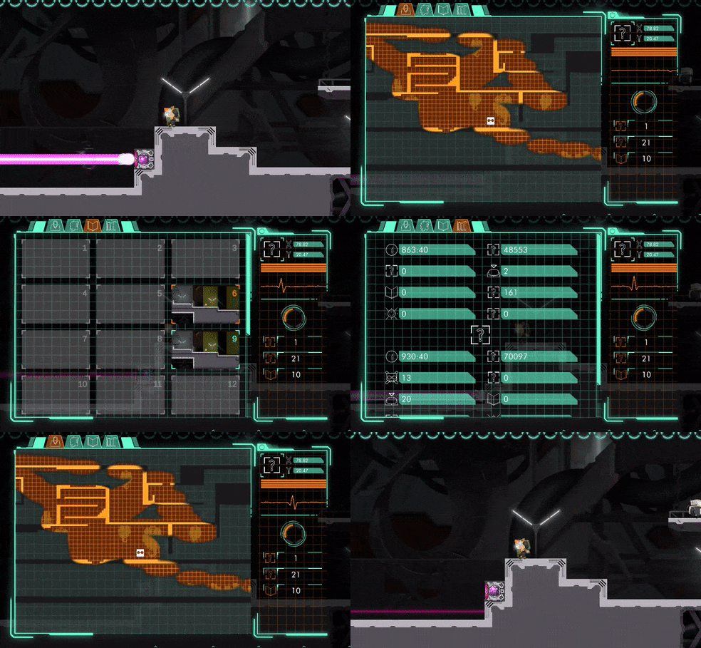
This week devlog we go through the hurdles that we had to pass in order to get the map system that we wanted to deliver to you guys.
We also finally ended the character screen and are aiming to start the third area of the game this week! We are already working on the area tiles and hopefully next week we can give you guys a sneak peek of what you will be playing!
Until then don't forget that you can try the super early alpha over on our Discord Server (we are running the early alpha in there)!
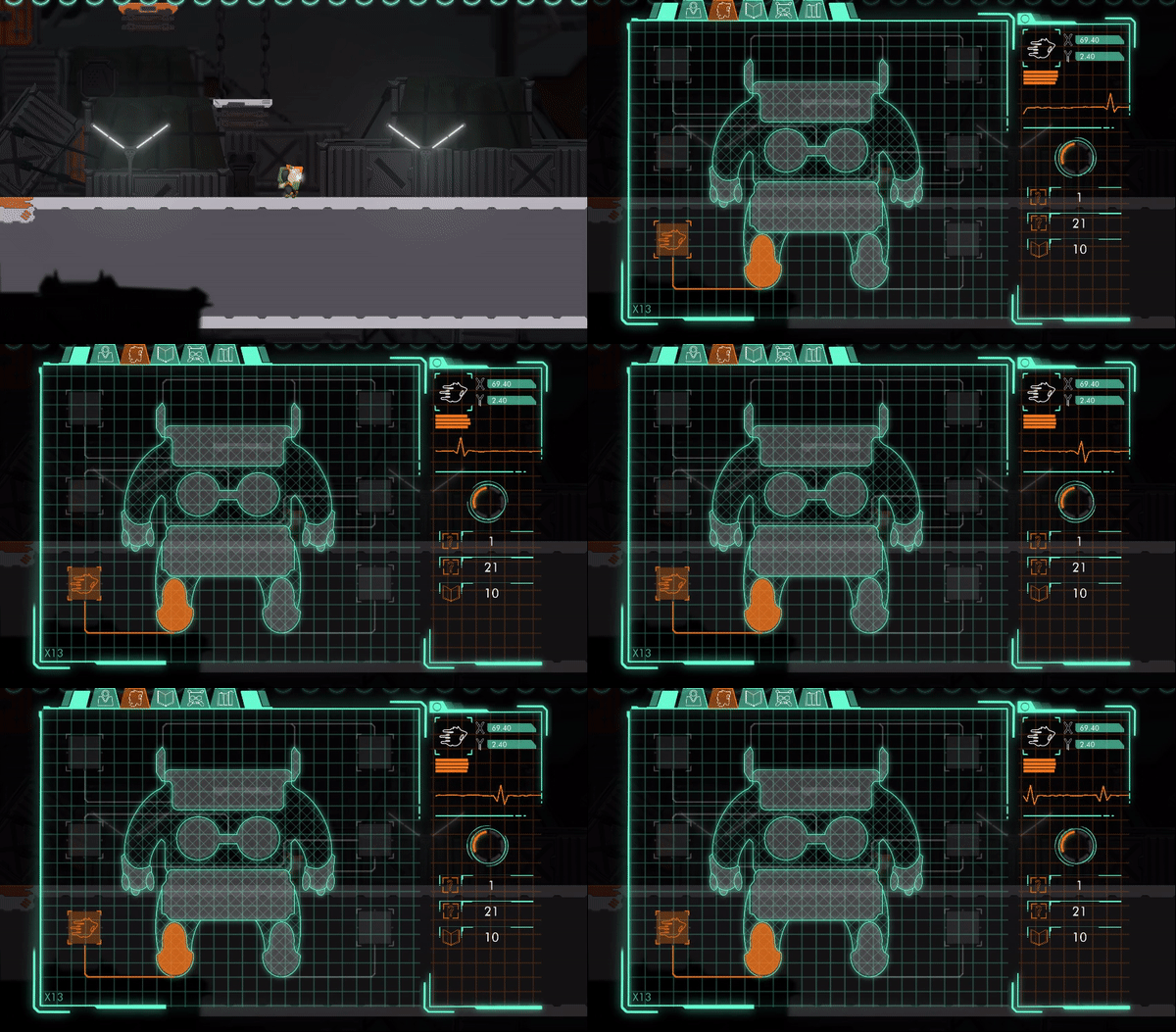
This week we finally jumped in headfirst to the in-game UI, we finalized the fist tab that serves as a guide to the skills that you progressively unlock and made the side panel which is misc of information, from location to inventory. You can read more about it on our blog.
Don't forget that you can try the super early alpha over on our Discord Server (we are running the early alpha in there)!
We want to start 2020 with a proper alpha build for you guys, so we finally decided to do a proper UI that is actually usable to other human beings besides us. You can read all about it on our blog.
Don't forget that you can try the super early alpha over on our Discord Server (we are running the early alpha in there)!
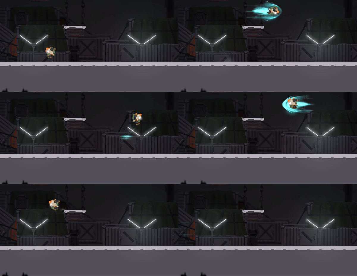
This week we continued working on Oirbo VFX as you can see from the dash preview above.
But besides that, we finally locked in the story and how we will deliver it, it may not seem much but it means that we can start working on the systems and on world with much more confidence that we had for this previous 2 areas, where we would leave places blank to put future lore related stuff.
Besides the story we also started working on the UI: