Factorio - Klonan
Read this post on our website
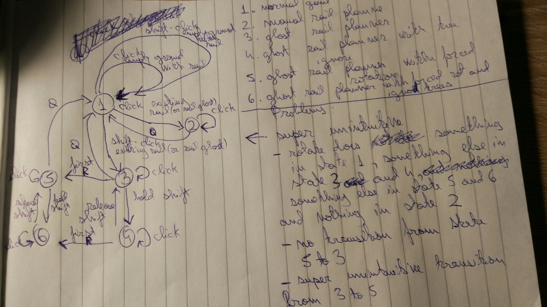
The problems were reaching the surface from time to time, and Twinsen even drew a nice little state diagram of the rail building system.
It kind of peaked with this bug report. After some time, it became clear that we should simplify it.
This is a nice example, where we can talk about change we just released (0.17.29) in a FFF.
From now on, instead of 3 modes (building manually, ghost building, ghost building + tree/rock removal), we have only 2 modes, where the ghost building without obstacle deconstruction is not available anymore. So it doesn't matter anymore how you start the building, it just matters whether you are holding shift or not at the moment, which makes it consistent with the normal entity building and the ghost icon.
Once the topic is opened, it is hard to leave it so easily, so we agreed that the rail building could be streamlined even more. The current model is, that you have to build one straight piece of rail first, and then you can use the rail builder on the edge of that rail. It is annoying generally, and especially for the new players, because he might miss the way how it is being used, as the straight rails are built exactly the same way as other entities. The reason we did it this way was mainly, because when we first introduced the (new at that time) rail builder, we weren't confident enough that it could replace even the basic straight rail building. But since the rail building is stable enough, we might go one more step forward.
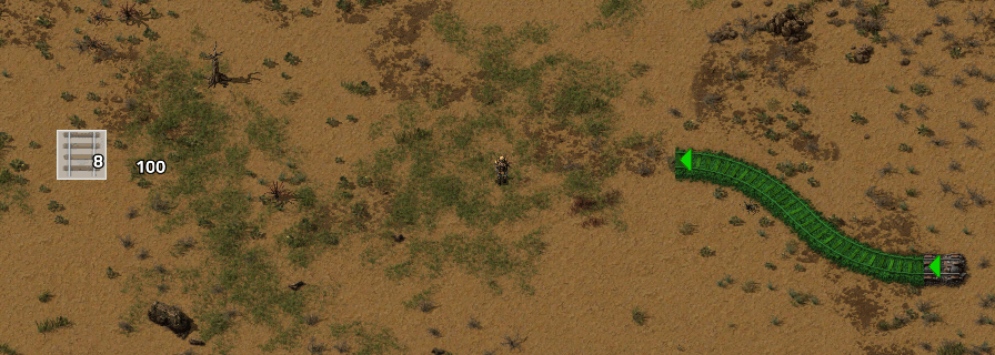
The plan is that the rail won't be used to build straight rails normally the way you can now. The rail item would be always used to build by the rail planner only. Instead of having to snap to an existing rail, you could just start building anywhere on the ground. Instead of showing the rail preview when holding the item, you would see the arrow as when starting the rail building, and you could rotate it with the R key. It would make sense, to make the arrow color/size different for starting a rail planner on the ground versus snapping to an existing rail, but other than that, it would be the same.
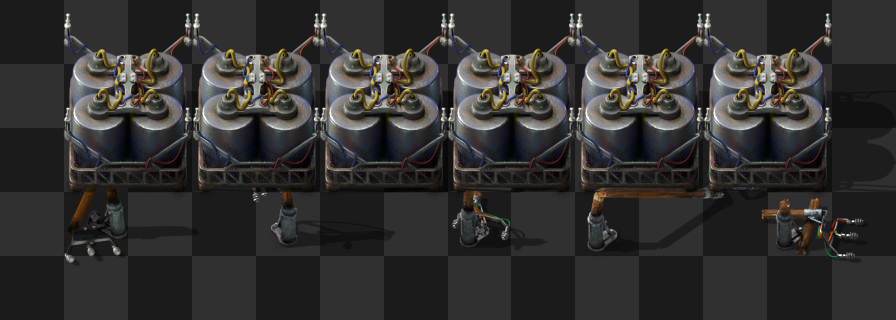
This is not a perfect solution because we use the same set of icons in the GUI and in the world. That means that the zooming level of the game can re-scale them up to 25% so we lose pretty much all control of the bitmaps, and the readability of them is affected. Now with the high resolution possibilities of the new GUI system, we need to double the size of the bitmap, therefore the original icons must be 64px in order to have a correct visualization at 200% GUI scale. We are still using them in the world, so the engine can rescale them up to 9.55%. The amount of out of control pixels is now much more serious.
Unisize vs Mipmap
We are exploring some possibilities and we want to keep it simple. For now we are testing the limits of our old technique: one single bitmap for all the uses.
https://cdn.factorio.com/assets/img/blog/fff-290-zooming.webm
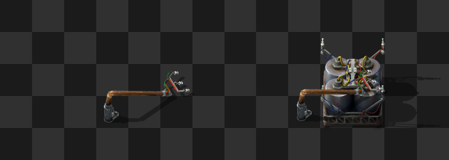
Delight yourself with this test icon placed on the belt. 64x64px size, every square is 8px. With it you can see how extreme the resizing can become:
From maximum zoom level 3.053 = 76.325% icon size.
To minimum zoom level 0.382 = 9.55% icon size.
To solve the problem for making it work in all the situations we design the icons in a very synthetic way. We simplify the shape to its purest meaning like the case of the assembling machines, where 1 gear + the color indicates level 1, 2 gears means level 2, etc.
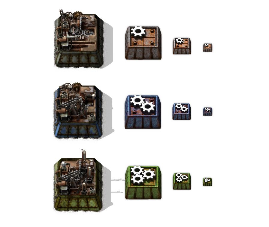
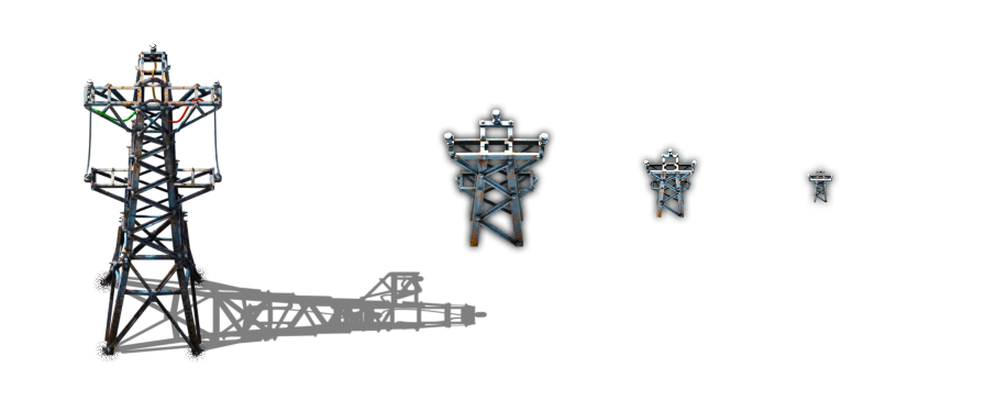
This solution works but we have a lot of icons (~355), and many of them are very complex in their shape and/or meaning. In some cases this complexity is essential at the time of designing the icon -especially the entities- so we need to find the proper synthesis for each icon as we did with the assembling machines. They work fine at any zoom level, even at 128px. But with other entities, like the big electric pole, it's more complicated to keep this level of minimalism due to the fact that the shape itself is already complicated in its essence. If we make it less complex, we wouldn't be able to recognize it anymore.
A possible solution would be using a very minimalistic flat icon, but this wouldn’t be integrated as an object in the world. We don’t like that.
The other solution is using mipmaps. So we use different versions of the same icon optimized for different zoom levels. We would notice the change of version at certain zoom levels, and for solving it we must complicate the situation. This complication would be not just for the code to create some crazy crossfading effect, but also for the designers to keep the several versions of the icon close enough as to not feel the change.
I would try to be pragmatic and I bet for the unisize solution based in a proper synthesis, but it’s not going to be easy for sure, like the entire history of Factorio development.
As always, let us know what you think on our forum.
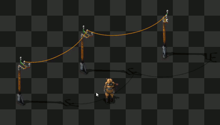
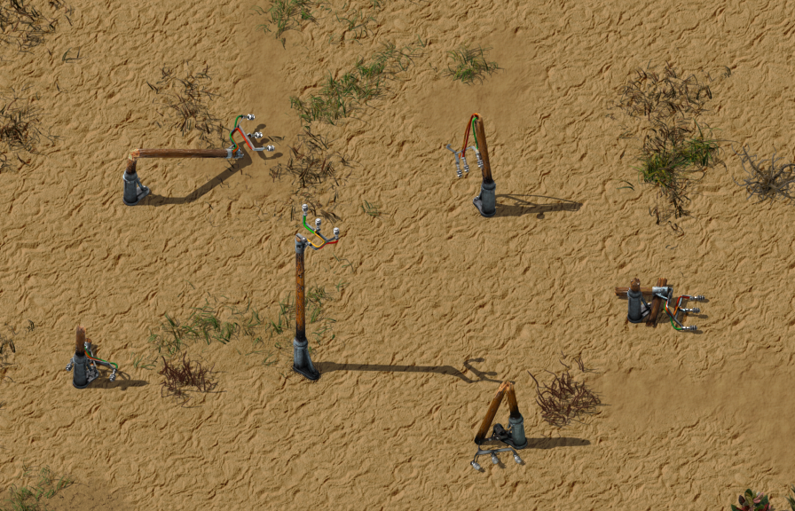
Rail building changes
The problem with rail building is that it has too many states. It depends whether you start building the rail with shift, to use the ghost mode or not, and then it also matters whether you still hold shift, to ignore trees or not. Moving from manual building to ghost rail building means cancelling the whole rail building and starting it again with the correct modifier.The problems were reaching the surface from time to time, and Twinsen even drew a nice little state diagram of the rail building system.
It kind of peaked with this bug report. After some time, it became clear that we should simplify it.
This is a nice example, where we can talk about change we just released (0.17.29) in a FFF.
From now on, instead of 3 modes (building manually, ghost building, ghost building + tree/rock removal), we have only 2 modes, where the ghost building without obstacle deconstruction is not available anymore. So it doesn't matter anymore how you start the building, it just matters whether you are holding shift or not at the moment, which makes it consistent with the normal entity building and the ghost icon.
Once the topic is opened, it is hard to leave it so easily, so we agreed that the rail building could be streamlined even more. The current model is, that you have to build one straight piece of rail first, and then you can use the rail builder on the edge of that rail. It is annoying generally, and especially for the new players, because he might miss the way how it is being used, as the straight rails are built exactly the same way as other entities. The reason we did it this way was mainly, because when we first introduced the (new at that time) rail builder, we weren't confident enough that it could replace even the basic straight rail building. But since the rail building is stable enough, we might go one more step forward.
The plan is that the rail won't be used to build straight rails normally the way you can now. The rail item would be always used to build by the rail planner only. Instead of having to snap to an existing rail, you could just start building anywhere on the ground. Instead of showing the rail preview when holding the item, you would see the arrow as when starting the rail building, and you could rotate it with the R key. It would make sense, to make the arrow color/size different for starting a rail planner on the ground versus snapping to an existing rail, but other than that, it would be the same.
High-res icons
Until now with the old GUI non-scalable system, we hadn't had much of a problem with the icons. We use one single version of 32px to display in the GUI slots, and the zooming system of the game takes care of the re-scaling for the rendering in the world.This is not a perfect solution because we use the same set of icons in the GUI and in the world. That means that the zooming level of the game can re-scale them up to 25% so we lose pretty much all control of the bitmaps, and the readability of them is affected. Now with the high resolution possibilities of the new GUI system, we need to double the size of the bitmap, therefore the original icons must be 64px in order to have a correct visualization at 200% GUI scale. We are still using them in the world, so the engine can rescale them up to 9.55%. The amount of out of control pixels is now much more serious.
Unisize vs Mipmap
We are exploring some possibilities and we want to keep it simple. For now we are testing the limits of our old technique: one single bitmap for all the uses.
https://cdn.factorio.com/assets/img/blog/fff-290-zooming.webm
Delight yourself with this test icon placed on the belt. 64x64px size, every square is 8px. With it you can see how extreme the resizing can become:
From maximum zoom level 3.053 = 76.325% icon size.
To minimum zoom level 0.382 = 9.55% icon size.
To solve the problem for making it work in all the situations we design the icons in a very synthetic way. We simplify the shape to its purest meaning like the case of the assembling machines, where 1 gear + the color indicates level 1, 2 gears means level 2, etc.
This solution works but we have a lot of icons (~355), and many of them are very complex in their shape and/or meaning. In some cases this complexity is essential at the time of designing the icon -especially the entities- so we need to find the proper synthesis for each icon as we did with the assembling machines. They work fine at any zoom level, even at 128px. But with other entities, like the big electric pole, it's more complicated to keep this level of minimalism due to the fact that the shape itself is already complicated in its essence. If we make it less complex, we wouldn't be able to recognize it anymore.
A possible solution would be using a very minimalistic flat icon, but this wouldn’t be integrated as an object in the world. We don’t like that.
The other solution is using mipmaps. So we use different versions of the same icon optimized for different zoom levels. We would notice the change of version at certain zoom levels, and for solving it we must complicate the situation. This complication would be not just for the code to create some crazy crossfading effect, but also for the designers to keep the several versions of the icon close enough as to not feel the change.
I would try to be pragmatic and I bet for the unisize solution based in a proper synthesis, but it’s not going to be easy for sure, like the entire history of Factorio development.
As always, let us know what you think on our forum.
Share: