Hello. It has been a quiet week in the office, we are slowly arranging everything needed for the office moving, which (if all goes to plan) will happen 7-11th of May.
Factorio-data repository
We received a request a short while ago from one of our mod creators, sparr, asking permission to host a public repository of all the Factorio prototype data. This has many potential uses for our community of modders and content creators:
Online references, cheat sheets, and calculators; can use it to automatically update when new versions are released.
Link directly to specific library code and entity definitions when discussing such matters on the forums, GitHub issues for mods, Discord etc.
Browse diffs between the versions, seeing the implementation of prototype changes we mention in the changelog.
It seemed like a pretty good idea, but we decided it would be better if we did it ourselves. That way we can verify and validate that it is correct, and also add it to our deploy process so it is fully automated. Wheybags made quick work of the implementation, so now all interested parties can check out our Factorio-data repository.
Pipe fast replace
We added the belt-fast replace feature back in 0.16 (more), but as it goes with adding QoL features, it makes us see the deficiencies in other areas.
So a very similar feature request was passed along to Dominik, "Same thing with the underground belts, but for pipes". It was completed a while back, but only recently was merged into our 0.17 branch, so I can show it off:
As always, let us know what you think on our forum.
Fixed that changing force of a wall didn't update the connections, which could lead to a desync.
Changed that walls and gates marked for deconstruction don't connect, which solves some desync related problems with walls/gates marked for deconstruction with walls/gates ghosts on top of it.
Changed, that rail signals marked for deconstruction disconnect from the rails.
Changed, that rail signals marked for deconstruction are not blocking blueprint placement of rail signals. These changes should make it reliable to mark rail setup for deconstruction and build blueprint right on top of it before it is deconstructed.
Changed the logic of "toggle LUA console" key to only open and not close the console (exception are ` and F1-F12 keys). more
Fixed LuaEntity::splitter_output_priority read/write didn't work. more
Fixed malformed sprite path error would not trigger minimal mode when loading mods. more
You can get experimental releases by selecting the '0.16.x' beta branch under Factorio's properties in Steam.
The long fight with the elusive Ryzen bug (more and more) seems to finally have some resolution.
A few weeks ago I sent an email to AMD, filling them in on the details of the crash, and asked them if they could help us solve this. Very quickly I was put in touch with a member of their CPU engineering team, and they got to work with their investigation. After a few days, and after providing them all the information we have (log files, source code, crash dumps etc.), the cause of the issue was identified.
Some other developers in the industry also had this problem and worked with AMD to fix it, so it's unlikely that the CPU bug was fixed only because of us, but we are honoured to have contributed to this. Unfortunately we do not have any technical or deep insight into where exactly the problem lay, or what the fix was, as it was somewhere between the motherboard BIOS and the Ryzen chipset drivers.
So if you are running Factorio on a Ryzen system, we advise you to update your BIOS using the files and procedures found on your motherboard manufacturer's website, and update your chipset drivers to the latest version.
PAX East Report
Two weeks ago we travelled to Boston to showcase our game at PAX East. I really like games and game conventions, so I was the lucky one who got to go to PAX East, after having already attended the Taipei Game Show. I was joined by Rseding91, v453000, Klonan, HanziQ and Jiri.
Compared to Taipei, PAX was much larger, with a lot more players reacting positively to Factorio, and many more people knowing the game.
We had a 4 banners showing the base mentioned in FFF-236, a TV playing the trailers, and PCs with the first two levels of the campaign (the first one was shortened quite a bit). These worked well together. The trailer got people hooked, the demo showed them what the game is about and the banners showed them that the game is very deep and complex.
We noticed a few categories of people coming to our booth (in order of most frequent):
Fans who already knew the game and wanted to show their appreciation, thank us or get some merchandise (we really should have brought more pins and t-shirts). Many of them would say "I wasted hundreds of hours in this game, you guys almost ruined my life".
Groups of friends passing by our booth, with one of them telling his friends "Oh, Factorio! Man, this game is amazing you guys really need to play it!". They would then proceed to explain the game to their friends.
People who heard about the game and wanted to give it a try.
People watching the trailers and having a chuckle when the biters get hit by the train.
Every one else who sat down to play the demo, either stopping after the first short level or playing all the way to the end of the second, longer level.
Like last time, it seems that the event didn't bring us much sales, but it's hard to judge since we already had a spike in sales when we announced the price increase and 0.16 stable. Nonetheless it was definitely nice to be there and meet the fans, other developers and members of the industry, and to play all kinds of games that were being demoed. It was also a great learning experience for us, in both event management and the impression that the game leaves.
Special thanks to RaZer and Dell Alienware for lending us the PCs for demoing the game.
While there I filmed some short clips, including a few with our booth and edited them into a video. The quality is pretty bad since I accidentally set the camera to record in 640x480. You can see the video on my personal Youtube channel here. We also made a small album with some photos here.
After PAX, HanziQ and Jiri visited New York City, while Rseding91 and I went to Los Angeles where we visited the Blizzard campus, Six Flags and also had a small meetup with a few Factorio fans.
From left to right: v453000, Rseding91, Klonan.
As always, let us know the way you feel on our forum.
Today we will speak a bit about the work in progress of the Technology tree, and the main GUI style/philosophy evolution.
The visual style is evolving and becoming more mature. The aim is to be as functional as possible, and also be pleasant to interact with, always having in mind the limitations of making it work in our engine. This is why we bet for a neutral and sober look that helps to focus on the relevant elements, without the distraction of possible decorative elements. This is not easy to decide, because the tradition of video-games is very rich in decorative GUI elements, and I'm sure that many of you would prefer having screws and rust in the corners of the metal panels and cables hanging everywhere in the GUI. Me too. Sometimes. I believe that once the GUI is completely functional, there will be some minimal decoration and this kind of fantasy, but this will be another chapter if it ever happens.
We are paying a lot of attention to the readability in general, according to the AAA standards of the WCAG. So the contrast with the panels and the font is increased quite a lot compared to previous mock-ups by simply using a contrast checker. Also the font size is increased by 2pt so it is more comfortable to read. Anyway, the user will have control of the font size in the options menu.
Bear in mind that the next mock-ups are a work in progress, and we still developing our standards, so some colours and solutions can vary through further iterations.
Getting to the point - Research queue
This picture shows the actuality of the state of the technology tree:
As you can see in the top left frame we added a new functionality. In this panel you can organize the order of your researches and see the progress in real time. The player will be able to cancel a queued technology just by hovering the card and pressing the cancel button. This progress is attached to the card, and will also be visible in the tree itself. See the screen below. The fluid wagon has been researched and you can see this in the tree and in the queue. By using the principle that, when the GUI tells you about some element, it always tries to use this very element, not a representation of it in another frame of the screen.
Featured Technology
The index of technologies remains as it is, but the position of the Featured technology frame is now attached to the tech tree, next to the technology itself. The link between the type of technology and info or interactions related to it, are physically tied. We are trying as much as possible to interact with the elements in situ, trying not to open unnecessary frames or pop ups of any kind and lose our visual focus.
The same happens with the research/queue button. It is placed on top of the featured technology and wraps it with a color indicating it's state, and providing the possible interaction. When the technology is researched, or unavailable, the button appears pressed and the color changes. The color code of the cards remains as before, we have just added a new orange state. Yellow for available, orange for queued, red unavailable, and green researched.As said above, tonalities may change in future, but this is pretty much it.
The opposition
As this is a dev blog post, it might be nice to show you some internal part of the process. The thing is, that my domain is mainly programming and gameplay, and Alberts domain is graphics. GUI is often something in between, so the two views on the subject tend to be hard to agree on occasionally. In situations like this, and I can tell you that there were a lot of these over the years, we are able to argue for quite some time.
The proposal comes to me and the inevitable discussion about how is the GUI actually going to be implemented. I really love the overall change of the looks, it suddenly looks so much better and professional. But obviously, different people have different priorities, and are used to different things in UI. I personally had problem understanding, that the Queue button is actually a button on a first glance. I'm used to the standard (not only in Factorio), that a confirmation button is in the right bottom corner of every window. I am also used to the fact that text button just looks the same everywhere, so I can recognize that it is a button instantly.
As a reference I would like to show the blueprint confirm.
It was never designed by Albert, and will be touched by the UI changes in 0.17, but it might be a good lesson about standards for us anyway. It is the confirm like window, that doesn't have the confirmation button as a text button in the right bottom corner. It has a sprite button in the top right corner instead. We have it in the game for quite some time, so we should be used to it, but I still feel like I'm lost for split of second when this window appears and I would actually prefer if it was standardized.
I understand that there is very good reason to have the proposal done this way, both graphically and logically, and I'm aware that Alberts understands the importance of standardisation more than me. We might just have different views on what is the more important principle when these come into conflict. It might be interesting to see what has the reader to say.
Epilogue
As you can see, the GUI re-design tries to be very respectful to the current one, making changes only when is very clear to us that is for the best of Factorio, and not for the sake of changes. I'd like to talk about more subjects, like multi-resolution, HR tile-set, modularity, animations, other mechanics and some more GUI philosophy, but it's late and there are more Fridays.
I'm very curious to see what you think about it in the forums.
Hello, since 0.16 is stable we can assign more of our effort into the work on 0.17. One of those features planned for that release is the Rich & interactive text.
Having more text formatting options was one of the things we wanted for quite some time, and it is finally starting to become reality in the 0.17 branch.The initial motivation was to have more possibilities in the tutorial related texts, but it proved to be useful having it available globally in the game.
The current format for any text markup we use is [<type>=<value>], but it might change somehow before 0.17 hits the public. This feature is being developed by wheybags, and it is progressing forward quite steadily.
Basic text formating - font and color
The obvious option is to allow changing text color:
and to allow to change font:
Images - icons
Since we already have a system to specify icons by the SpritePath, we can use it as well:
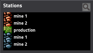
The cool thing about this, is that all these concepts work on basically all places where text is used, so you can use it in the station name for example:
or even save names (although, I needed to add a possibility to use "." instead of "/" in sprite path resolution to make it possible):
or blueprint names:
etc.
Element references
The next planned step will be to make it possible to allow this not only to be used as icons, but as references to the actual items, so the syntax would be something like:[item=straight-rail] or [recipe=advanced-oil-processing]. When used in the chat, it should allow the reader to hover over the icon and get a tooltip of the corresponding game element. When used with technology, it could allow the user to open the mentioned technology by clicking the reference icon.
More advanced usages
This brings us to the more advanced possibilities, like linking a map position as a clickable icon in the text (something like [gps=<position>]), referencing your armor, so other's can just hover it in the text and see it. Specifying target to specific train you want to mention and mainly, being able to reference blueprints this way, something like [blueprint=<blueprint string>] can you to show some specific setup in a chat, and others could be able to get the blueprint by just clicking on the icon if they want to.
I would be quite curious to see what other type of usages of this can you come up with, let us know on the forums.
As you are probably already aware, some of our team members are going to attend PAX East in Boston next week.
We figured we need some representative prints for our booth, but what to put there? We could have just made a big mega high resolution render of the player character or some other entity, but that would not tell the viewer much about what the game is about. So we thought it would be much better to "just" take a giant screenshot of a working factory, print it, and done! Now of course it’s much more complicated than that…
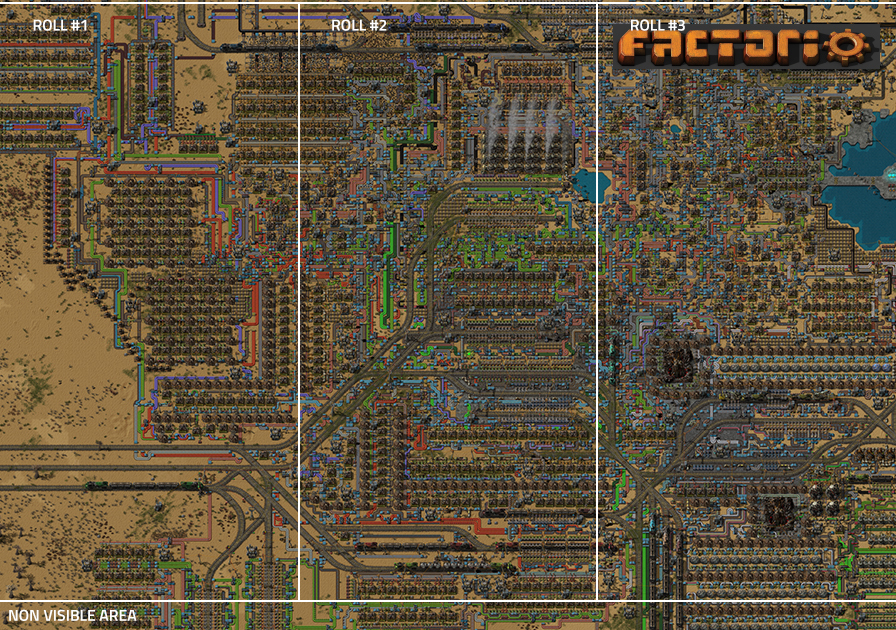
The first obvious hurdle is that you need a savegame to take this screenshot of. So you go and try to take a bunch of random saves on your disk, you open them and find that it’s not so easy to just find a factory which would look nice. Such a factory needs to show enough of the various things to represent the game, can fit the logo somewhere, and must be large enough to fill about 275x185 tiles (3x2 meters at 150dpi taken at game zoom 2)... one square in the following picture is a chunk (32x32 tiles)
Luckily I just had a savegame which was easy to adapt to those requirements, but I would like to ask the question, how does one build such a factory in general? That’s what I have been trying to figure out for a long time now. As some of you may have already noticed, I enjoy constructing very organic factories, a part of which eventually turns into a crazy mess. A mess as crazy as Factorio itself, representing what your will brain look like after playing Factorio.
I find this to be a good opportunity to be a bit more specific and see a few examples to put it into more context...
Building for big screenshots
It’s the year 2015 and pretty much every factory I had built so far eventually arrived to the problem that in order to expand it, I would have to severely modify or destroy large portions of it. I hate to just throw away all the work that I did on my belt knots, so the outcome would usually be that I just stop playing that map and start over.
Example 1, codename: MessFort:
Once I made a factory that was my largest so far. It used Bobs productivity modules level 7 with a stupid amount of productivity bonus, possible to put into any recipe, and without decreasing the speed of the machine.
This alone may sound ridiculous but what it did was allow me to focus on just having fun adding more and more things to the factory, while caring about throughput much less, especially in situations where I could just add better modules to existing factories, leaving more ingredients for other things, allowing me to build even more production lines.
Of course sooner or later the furnace area would just not be enough and expanding it on the spot would be a pain, so I just started a new dedicated factory just for smelting like many factories do. Trains brought the necessary things and later on I added another factory for circuits and the factory kept being happy. Eventually I dropped under 40 UPS and didn’t want to continue any more. It’s worth mentioning that there was no space science or infinite research back then, so there was little incentive to continue.
Discoveries
Mixed belts (different item on each belt half) are a huge amount of fun to work with, and add more visual variety.
Automating as many different recipes as feasible is one step towards a nice looking base.
Example 2, codename: SpaceScienceBase
In the second half of 2016, I started a new factory. Learning from the past discoveries, I wanted to embrace the concept of replacing production lines for intermediates with train stations which would import these items.
Producing those intermediates however required a large rail system outside of the main belt cluster. This gave the factory a lot more expandability and I had spent more time on this map (160 hrs) than any before by a large margin. Like all nice things, the amount of effort directly influences how nice is the result going to be, as with the outer train network expanding, the main base also continued to grow.
Discoveries
Having rails inside of the factory adds a lot of depth by breaking the monotonous assembling machine + belt mess.
Pipes and oil-related entities are awesome to have in the base so that not everything is an assembling machine.
Examples 3 and 4, Codenames: TrainMaze and MOAR
In the following several months I would try to start a few new maps with different factories and different concepts, but each time something just wasn’t going in the right direction and eventually I would recognize that it’s not "The One" and lose interest in it.
I was starting to feel like it was only a matter of luck, and I only made the SpaceScienceBase look awesome by accident as I couldn’t deliberately achieve the same again. I kept thinking about what it is that makes it stand out, what are the differences from the other two, for example:
Disabling biters or minimizing military removes many recipes to automate, and easily leads to a less interesting factory.
Too many straight and rectangular patterns just look visually uninteresting.
Preparing all setups for beacon rows from the beginning forces a lot of straight predictable lines.
Horizontal production rows of machines generally look better than vertical columns, but having some vertical columns is good for variety.
I believe a part of the problem was how I focused on efficiency by preparing for whole rows of beacons for everything (especially the vertical ones), or how I separated the oil and rail related entities from the core of the main factory. Everything just ended up being straight and boring.
Example 5: GridLock
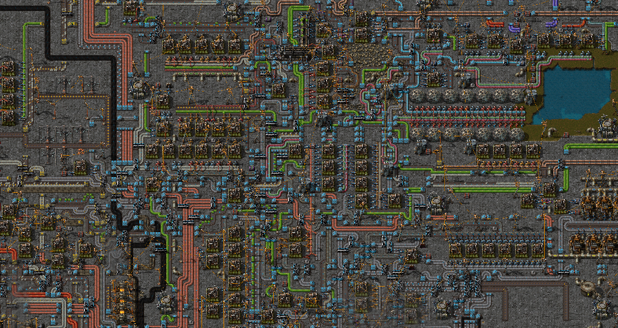
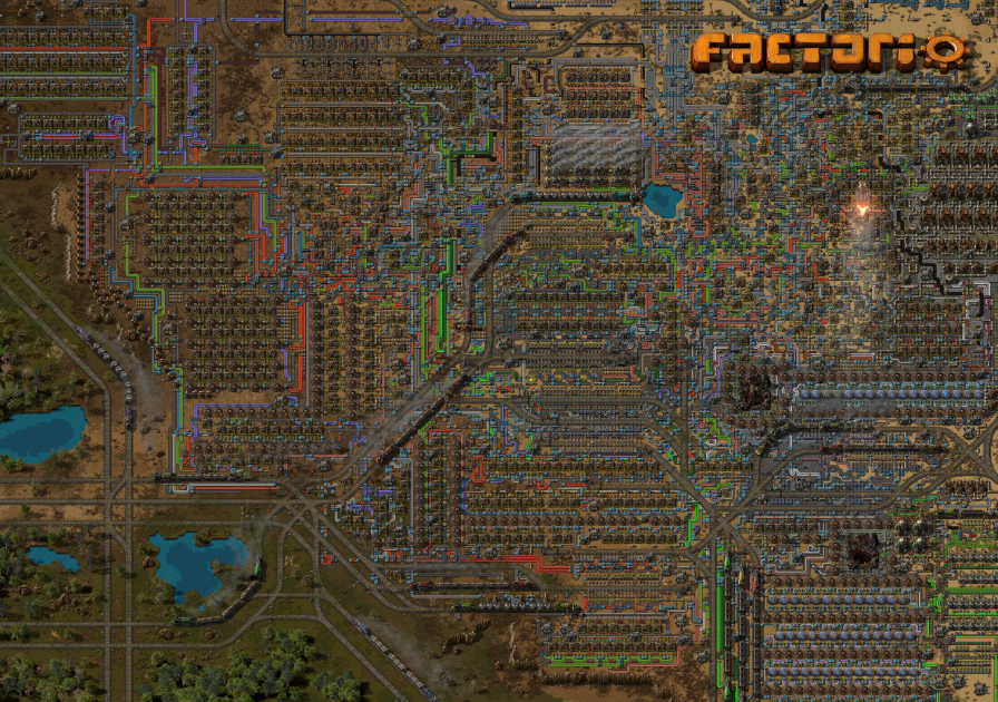
So eventually I started a new map with all of those things in mind. I made a rough plan for myself what I would like it to end up, and then tried to follow it. The rail system would be extremely expandable but use both single and dual headed trains for variety, the main factory would automate literally every single recipe in the game, and I would try to keep things as organic as possible. I could have tried harder to put more pipe and nuclear related entities in the middle of the factory... perhaps next time I guess.
Here you can see it grow: https://youtu.be/UJPFUQhnXS8 When I was building, I saved over 300 iterative versions of the map. The timelapse is then created by taking a screenshot in each of those saves, and in post-production they are blended together so that it looks smoother.
I found out that we need a screenshot of these dimensions just shortly before the logo appears on the map. You can see not much had to change, except all the terrain under the whole screenshot area was manually reworked in the map editor. This gave me a bunch of ideas of what we need to do to make the map editor better - both for our use with scenarios and campaign, and for our players.
If you are interested in reading more about how the base works or downloading the savegame, you can proceed to the imgur album.
The final result is a trio of rollups totalling 3 meters in width and 2 meters in height. This whole thing has been quite an experience for me. Building a factory and doing my own fiddling is great, but building a factory, sitting down with Albert (our art director), thinking how to improve the general visual composition of it, making it fit the requirements etc. was just outright amazing. Just the part where I needed to put the logo and remove a bunch of train stations, cut many belts and reconnect them, was a very cool challenge. If I started again I would have probably done a few things differently, but something would probably be wrong if I didn’t feel like that. Overall I must say I am quite satisfied with the result.
Imagine a friend of yours is trying to introduce you to this game, shows this screenshot to you and says: "Hey, this is the game I have been repeatedly telling you about lately..." What would be your response?